Issue 01: Finding the best data visualization library for my React projects
Hi there 👋
First of all, thank you for subscribing and reading the first issue of my newsletter. I'm excited to share more content with you through this medium!
In this first issue, I wanted to talk about data visualization libraries for React.
In my "not so long" career as a frontend developer, I've always struggled with them especially because most of them seem to lack what I'd call a balanced developer experience, especially compared to the experience libraries like React provide.
That imbalance is mainly caused by most libraries being exclusively at the extremities of a spectrum going from very opinionated to D3.
The spectrum of data visualization libraries
On one side of the spectrum, you'll find very opinionated libraries that put some solid guard rails for the developer to build charts.
One of them I used a lot is Recharts which has been doing a great job for me and my teams to output some great chart components very efficiently. However, the moment we wanted something a bit out of the ordinary, or simply customize it, we ended up spending a significant amount of time working around these guard rails, and that's not great.
On the other side, we find some super low-level libraries like D3.
Don't get me wrong I love D3, the problem here is not so much in the library itself but more in the investment that it requires before being able to reach a great development speed.
I've also seen many teams building a couple of charts rapidily, but then ended up with an endless stream of non-reusable code which meant we would enventually have to refactor them.
(also I don't know about you but I'm pretty scared when I have to read through some D3 codebase 😱. Compared to React, it's harder to digest. I have huge respect for the people building crazy visualizations solely with D3)
In a nutshell:
- very opinionated libraries 👉 spend most of your time working around limitations
- low level of abstraction 👉 spend most of your time building basic components/primitives
Discovering visx
If you follow me on Twitter, you might have seen me talking a lot recently about an awesome and fairly unknown library (at least, I've never heard about it before) called visx.
Why is visx so awesome?
- It's a bit higher level than D3 and provides a DX familiar to React developers. "If you know React you can make visualizations"
- Despite being higher level, it's also very un-opinionated: want to style your chart with your in-house CSS-in-JS library? Use another animation library to animate your charts? No problem!
- It's not trying to become your charting library. By far my favorite take. I never really wanted a "charting library" what I always wanted was just a bunch of pre-built visualization primitives like an axis, a legend, shapes... and then use these primitive to build the charting library my team needs.
(also on top of it's well documented and the team split the set of primitives into multiple packages to keep bundle sizes down 🙏 what's not to love about it!)
I truly think visx is the right take on what a data visualization library should look like.
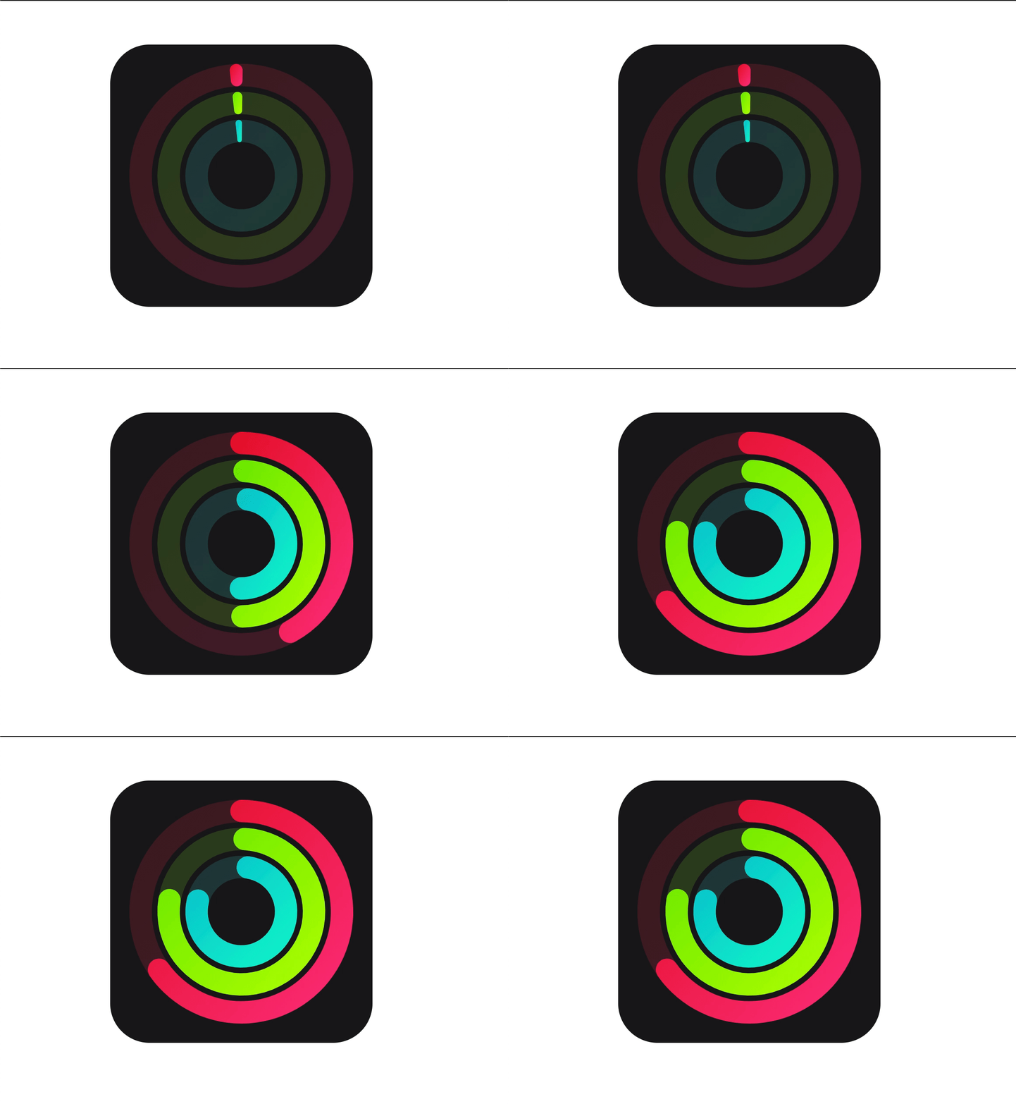
At some point, I might dedicate a full blog post on visx if I find enough interesting materials. In the meantime, I'm just trying to build some cool stuff with it, which honestly was surprisingly easy especially because I'm usually not the best at this kind of things 😅:
Apple Watch Activity Rings

Line chart with drawing animation with Framer Motion

That's it for now! I hope that this first issue inspired you to explore the world of data visualization even if up until now it felt pretty inaccessible if like me you've wrestled a lot with D3 codebases in the past.
Thank you for reading, and have a wonderful day!
PS: I'm not sure if I'll share code snippets in this newsletter just yet but in case you're curious and want to check out some visx code, here are a few links for you:
Did you like this Maxime's ideas issue? Click here to spread the word and share this newsletter on Twitter. I really appreciate your support!
Want to checkout other topics I wrote about? There's a lot of great content waiting for you on my blog 👉 blog.maximeheckel.com