Sequences #2
Tonight I’m thinking about motion in comics. Everyone who cut their teeth on manga has a favorite purveyor of action, of crumbling cities and bodies flinging into other bodies, breaking a silent sound barrier in our minds. I thought I’d pick through my archives and talk about how we can show motion and the unique ways some artists depict it.
It takes times for the brain to process visual information when it sees an object. To make up for the delay, our brains predict where things are going to be, perceiving moving objects farther along their trajectory than where it actually is in reality. Cartoonists often rely on the principles of animation to learn motion: deforming the object (squash/stretch/exaggerate/line of action), pacing (anticipation/accents/timing) and overlapping actions. I think comics has a wider variety of techniques to show or trick the eye into perceiving motion or moving itself.
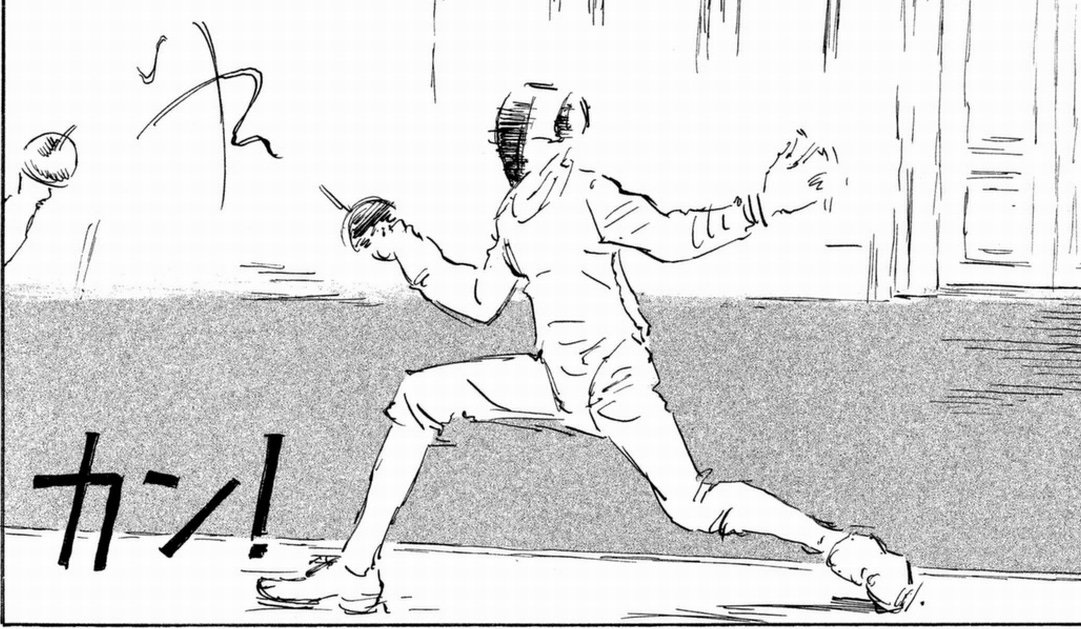
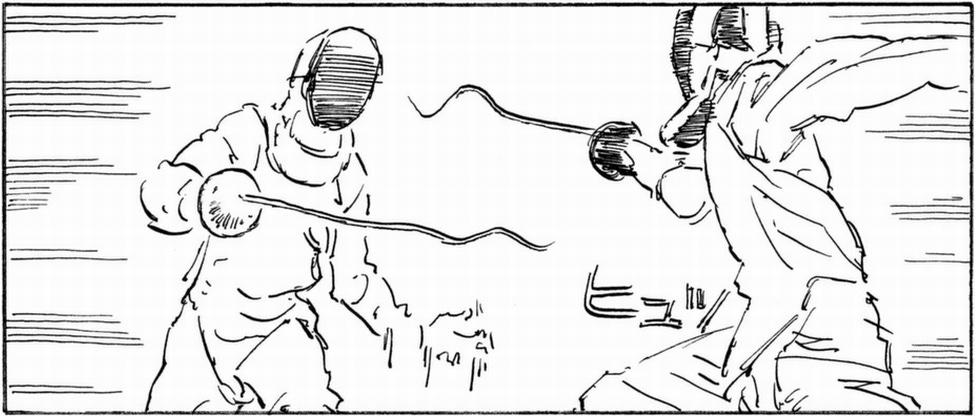
These panels above from Daisuke Igarashi’s Designs are done so sparingly, the wiggling jitter of the foils matching their their future path as they’re maneuvered towards their intended point of contact.
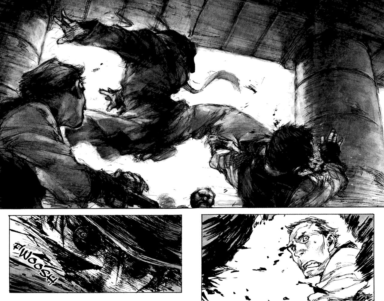
I think this change in rendering in Fung Chin Pang’s C.A.T 13 , a shadowy, smudgy inkwash technique to counter the stark scratch of the normal line style is genius. The jump feels like its being done in slow motion, weighted down by the heavy ink, moving as though through some syrupy ether. Capturing slowness without it being static is incredible to me and why, even though I don’t care for this comic, this page has stuck with me.
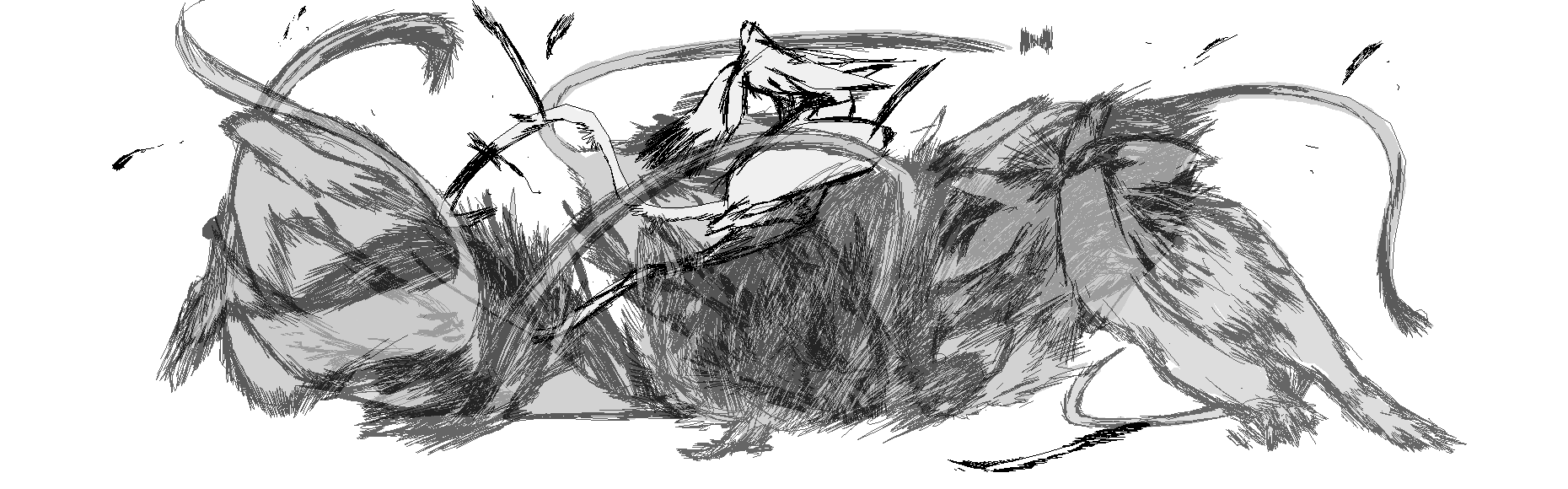
From Secretary by Zachary Braun who I consider one of the King of Fight Scenes (psychic animal martial arts anyone?). I love the abstraction of this degu and jerboa as they cross fists and legs in a rolling technique. Their afterimages cross over one another transparently making the progression rapid fire and the demarcations of their body are bristled with energy and motion and flying tufts of fur.
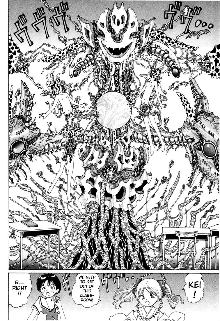
This page from Reach Ueshiba’s Dream User exudes motions simply from the huge mass of complex detail exploding from the orb-like central object. All the granular minutiae makes the eye jump madly around, never settling within the slightly off kilter composition.
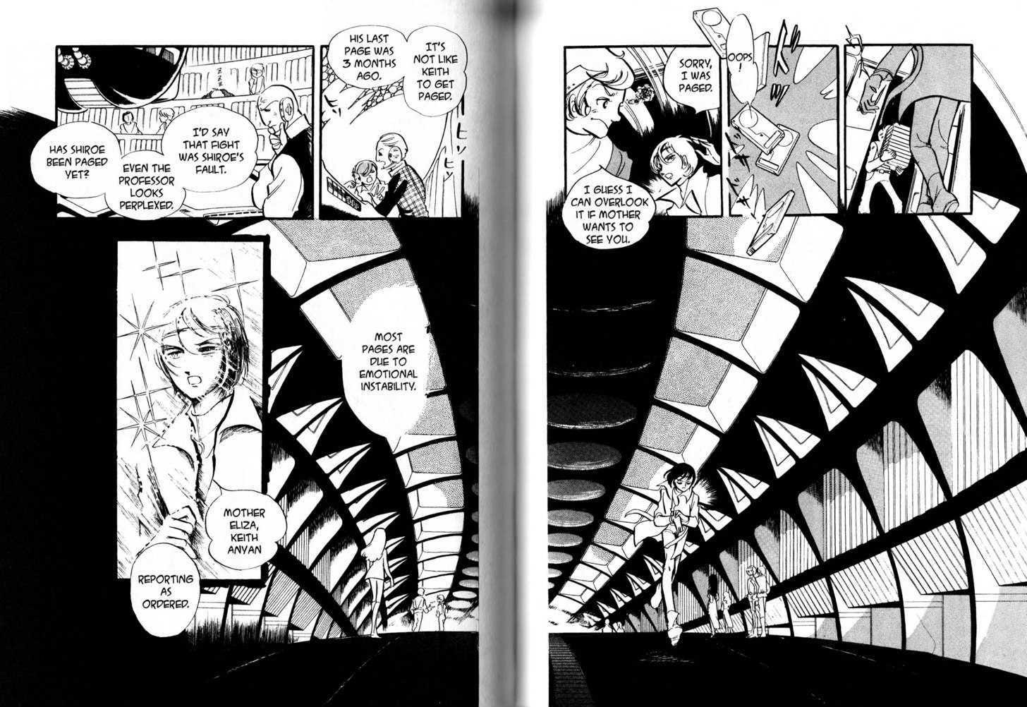
A spread from Towards Terra by Keith Takeimya. This uninterrupted perspective serves the same purpose as speed lines but feels more subtle as its integrated with the architecture.
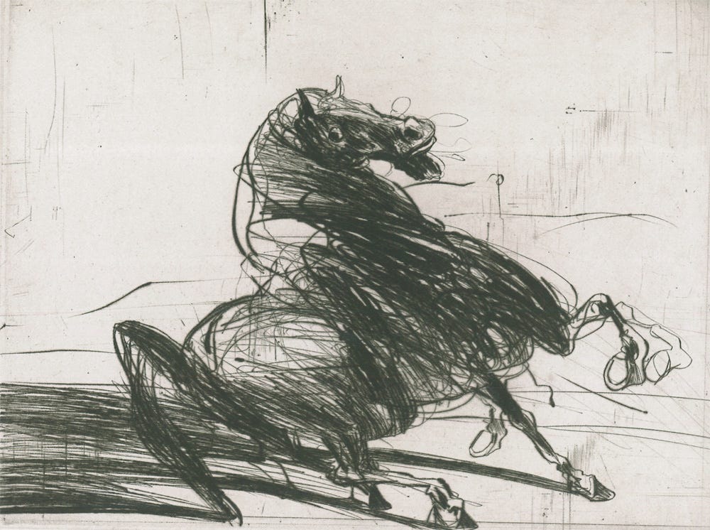
Not a comic but I love this Claude Weisbuch etching “the Refusal”. The energy in the line of its pose, the afterimages of its stamping hooves, the speed lines in the shadow. It’s wild and raw, the perfect depiction of unfulfilled energy, of the eye struggling to predict the next motion.