521: quantum of sollazzo
#521: quantum of sollazzo – 13 June 2023
The data newsletter by @puntofisso.

Hello, regular readers and welcome new ones :) This is Quantum of Sollazzo, the newsletter about all things data. I am Giuseppe Sollazzo, or @puntofisso. I've been sending this newsletter since 2012 to be a summary of all the articles with or about data that captured my attention over the previous week. The newsletter is and will always (well, for as long as I can keep going!) be free, but you're welcome to become a friend via the links below.
Well, you folks flatter me. The most clicked link last week was the video of my keynote at csv,conf,v7.
It's the first time that something about me has been the most clicked link since I started checking. Blushing :-)
'till next week,
Giuseppe @puntofisso
|
DO YOU LIKE QUANTUM OF SOLLAZZO? BECOME A SUPPORTER! :) → If you enjoy this newsletter, you can support it by becoming a GitHub Sponsor. Or you can Buy Me a Coffee. I'll send you an Open Data Rottweiler sticker. You're receiving this email because you subscribed to Quantum of Sollazzo, a weekly newsletter covering all things data, written by Giuseppe Sollazzo (@puntofisso). If you have a product or service to promote and want to support this newsletter, you can sponsor an issue. |
✨ Topical
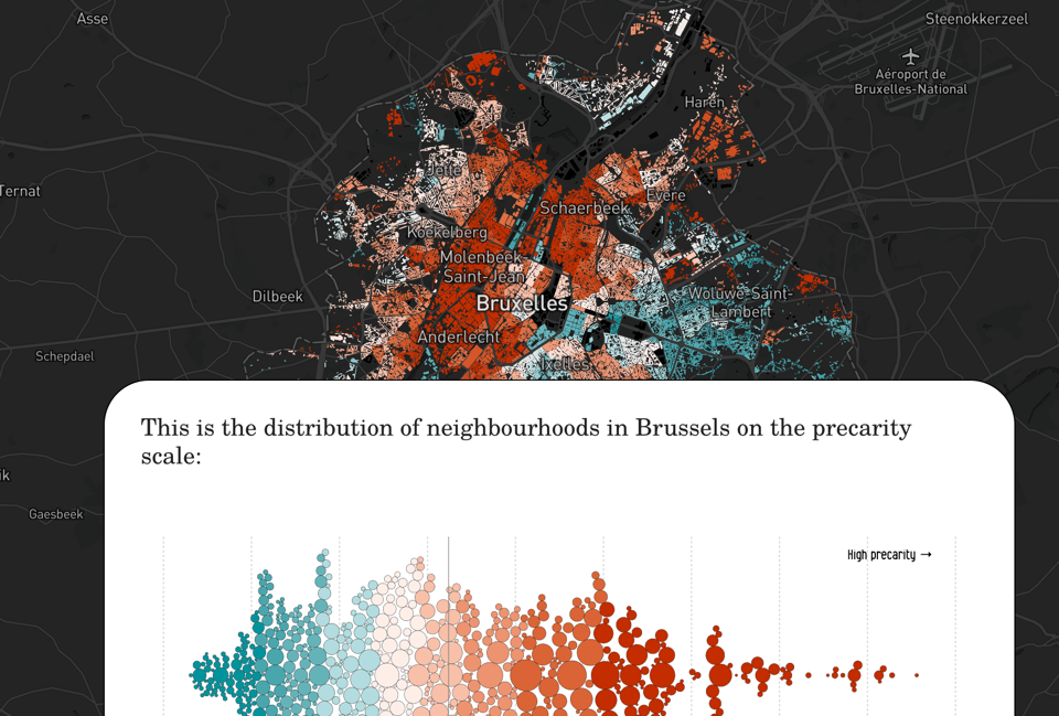
Ailing Brussels
"Portrait of a city where inequalities operate in a vicious circle".
This website is trying to support a journalistic campaign about environmental and social issues in Brussels, using data and dataviz to link the two.
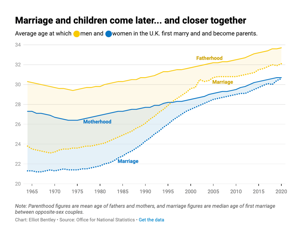
How long are Brits waiting to start a family?
Datawrapper's (and former Journocoder Elliot Bentley): "It’s no secret that, compared with our parents, we’re waiting later to get married and have children."
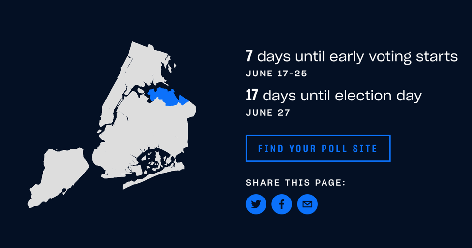
NYC 2023 Elections Are Here. Get to Know Your City Council District Before You Vote.
"Who represents you and who wants the job? How has your district changed? And who are the neighbors voting with you?"
This website will mostly be of interest to NYC voters, but I bet you'll love the brilliant visual approach that makes it so usable.
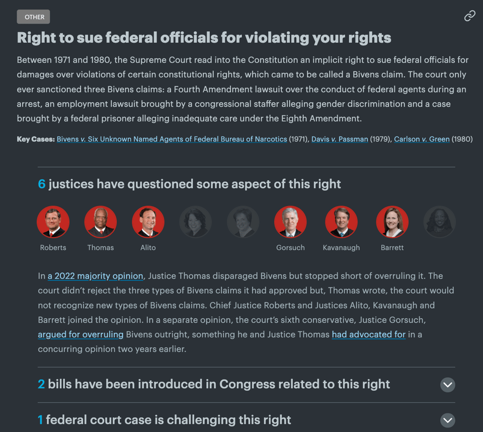
Supreme Risk
"An interactive guide to rights the Supreme Court has established — and could take away", by Ian MacDougall and Sergio Hernandez for ProPublica.
🛠️📖 Tools & Tutorials
SVG Images from Postgres
"PostGIS excels at storing, manipulating and analyzing geospatial data. At some point it's usually desired to convert raw spatial data into a two-dimensional representation to utilize the integrative capabilities of the human visual cortex. In other words, to see things on a map."
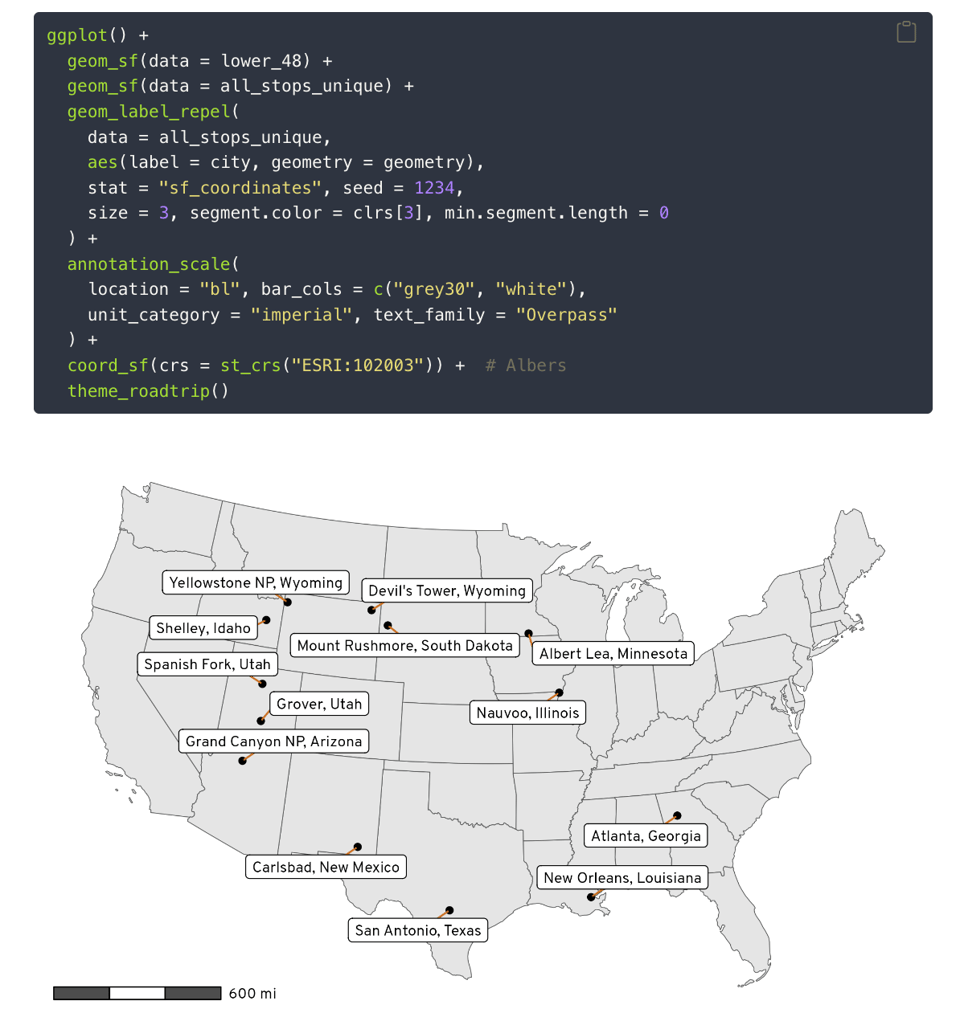
How to make fancy road trip maps with R and OpenStreetMap
"Use R to get geocoded location and routing data from OpenStreetMap and explore our family’s impending 5,000 mile road trip around the USA".
Academic Andrew Heiss regularly publishes useful R tutorials.
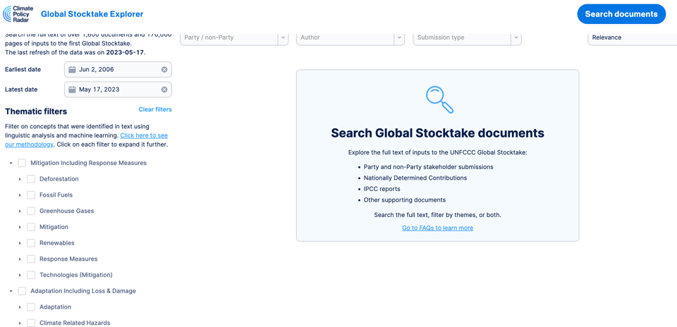
Global Stocktake Explorer
As announced by Kalyan Dutia, Principal Data Scientist at Climate Policy Radar: "Proud to reveal what we've been working on for the last couple of months at Climate Policy Radar and will be working on up until COP28 - a research interface to search and analyse all inputs to the first UNFCCC GlobalStocktake, powered by a whole load of continually improving NLP.
The Global Stocktake is the first iteration of the world assessing our collective progress towards meeting the goals of the Paris Agreement, and an exciting thing to be able to support."
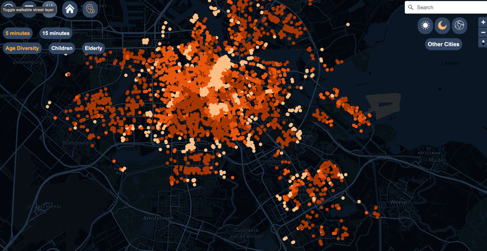
CTwalk map
"What opportunities for social cohesion do cities provide?
Is your neighborhood park frequented by a homogenous or diverse mix of people? How many amenities can you reach within a short walking distance? And do you often encounter people from different walks of life?
This is what the interactive CTwalk Map seeks to highlight."
As discussed in the "about" page, "CTwalk Map is an interactive web tool developed as part of research conducted by Vasileios Milias during his doctoral studies at the Urban Analytics Lab within the Knowledge and Intelligence Design group at Delft University of Technology."
It's not a dry academic website at all, and it comes with good descriptions of the methodology and data.
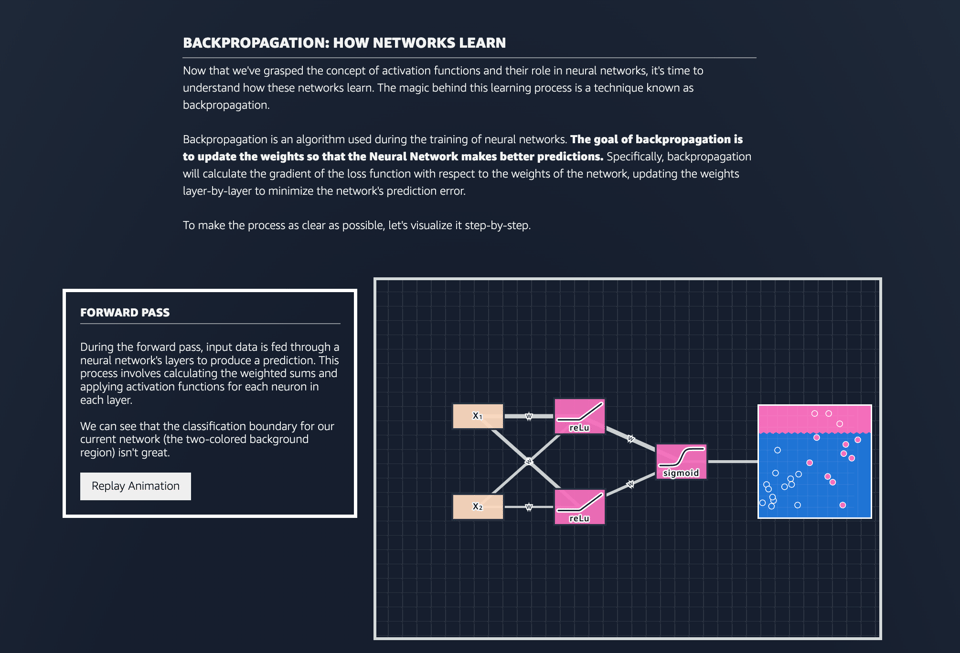
MLU Explain: Neural Networks
I've linked to MLU's tutorials before. They are really well-crafted interactive, visual essays. In this issue, they let you "journey through the fundamentals of feed-forward neural networks, starting from their essential components, understanding their learning mechanisms, and even getting hands-on experience by interacting with one ourselves."
(via Anantharaman Iyer)
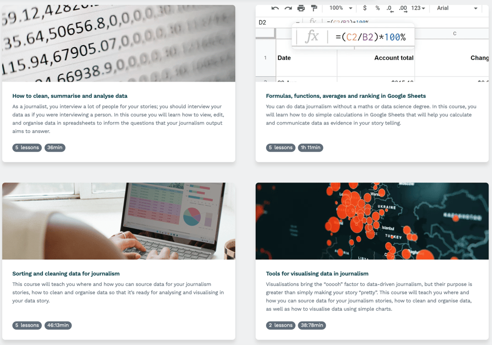
Africa Data Hub's courses
The Africa Data Hub's courses for beginners in data journalism.
What are embeddings?
A PDF document and GitHub codebase by ML engineer Vicky Boykis to learn embeddings from scratch.

Every newsletter is exactly the same, until now, because The Smithee Letter is different.
It's a fictional narrative sales letter, like if David Lynch and Cormac McCarthy morphed into one person and wrote a weekly story about an anonymous salesperson on the run from dangerous people as they fall deeper and deeper down the rabbit hole of the strangest, most absurd parts of America. The story may be fiction, but the products are real. And the newsletter is free, all "Smithee" (because that's not their real name, of course) asks in return: Open the damn emails and click the damn links.
🤯 Data thinking
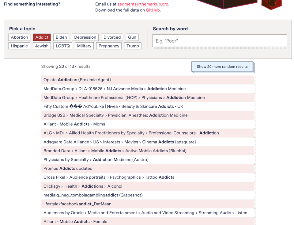
From “Heavy Purchasers” of Pregnancy Tests to the Depression-Prone: We Found 650,000 Ways Advertisers Label You
"A spreadsheet on ad platform Xandr’s website revealed a massive collection of “audience segments” used to target consumers based on highly specific, sometimes intimate information and inferences."
An interactive article, with links to data sources.
(via Lisa Riemers)
📈Dataviz, Data Analysis, & Interactive
Datascuptures
Data and art, by Anne-Laure Fréant.
(via Steven Feldman)
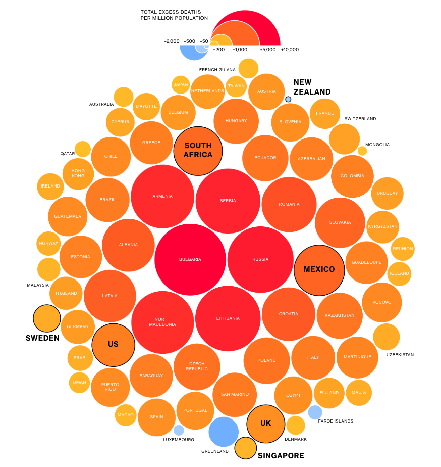
The Worst Covid Strategy Was Not Picking One
"Bloomberg Opinion assessed countries by excess deaths, a measure of actual deaths compared to expected deaths during a given period. It’s considered the most objective metric, because it doesn’t rely on access to tests (which might be unequal) or judgment calls (did Covid really kill this person, or was it a heart attack?)."
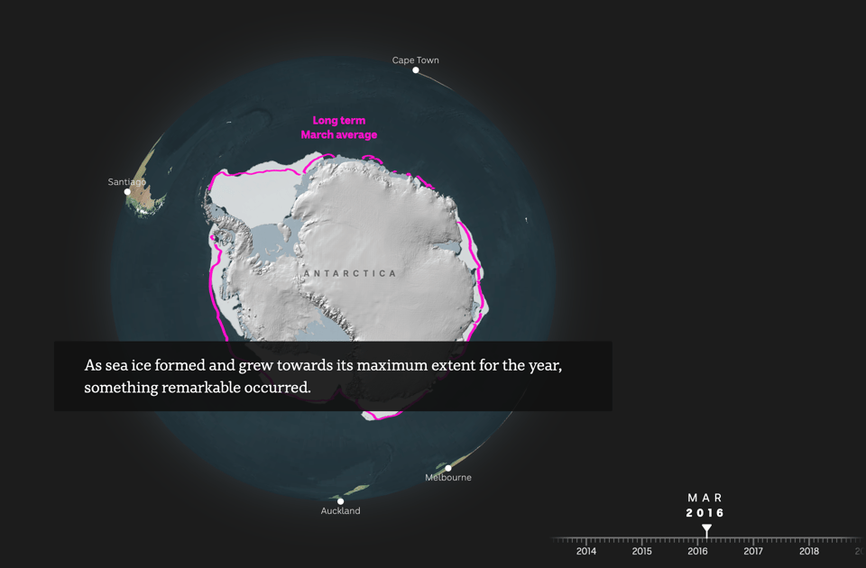
The Icy Pulse
ABC looks at arctic ice melting.
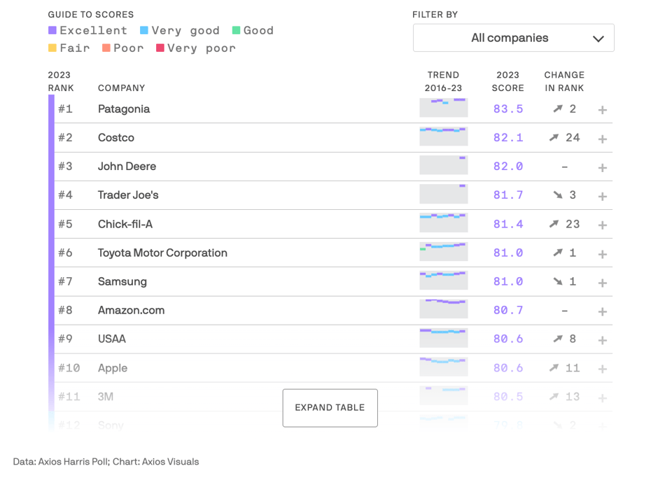
The 2023 Axios Harris Poll 100 reputation rankings
"This survey is the result of a partnership between Axios and Harris Poll to gauge the reputation of the most visible brands in America, based on 20 years of Harris Poll research."
Why 25% of teens can’t answer this question
"What jobs do 15-year-olds expect to do at 30?".
It's a video by Vox, but it provides also all data sources and a link to a codebook.
🤖 AI
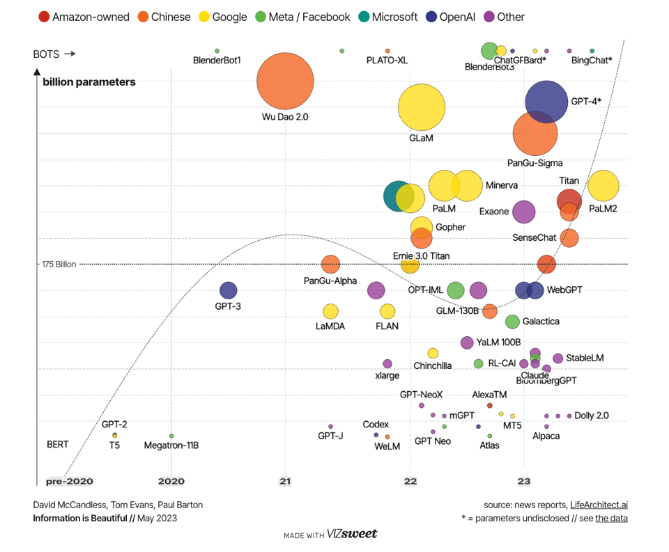
The Rise and Rise of A.I. Large Language Models (LLMs)& their associated bots like ChatGPT
A chart displaying the complexity of the language models.
Why AI Will Save the World
Well, I'm not so sure. This is by Marc Andreessen, who does have a not-so-vague interest in it.
quantum of sollazzo is supported by Andy Redwood’s proofreading – if you need high-quality copy editing or proofreading, check out Proof Red. Oh, and he also makes motion graphics animations about climate change.

Supporters* Alex Trouteaud casperdcl / iterative.ai Naomi Penfold
[*] this is for all $5+/months Github sponsors. If you are one of those and don't appear here, please e-mail me