520: quantum of sollazzo
#520: quantum of sollazzo – 6 June 2023
The data newsletter by @puntofisso.

Hello, regular readers and welcome new ones :) This is Quantum of Sollazzo, the newsletter about all things data. I am Giuseppe Sollazzo, or @puntofisso. I've been sending this newsletter since 2012 to be a summary of all the articles with or about data that captured my attention over the previous week. The newsletter is and will always (well, for as long as I can keep going!) be free, but you're welcome to become a friend via the links below.
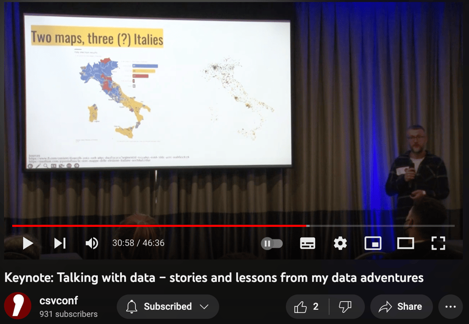
As some of you already know, I gave a keynote at csv,conf,v7 last April in Buenos Aires. The video of my talk is now freely available on YouTube. It's a walkthrough my journey through data wrangling, open data advocacy, data journalism and comms, data-driven analytics and AI, with an eye on data ethics.
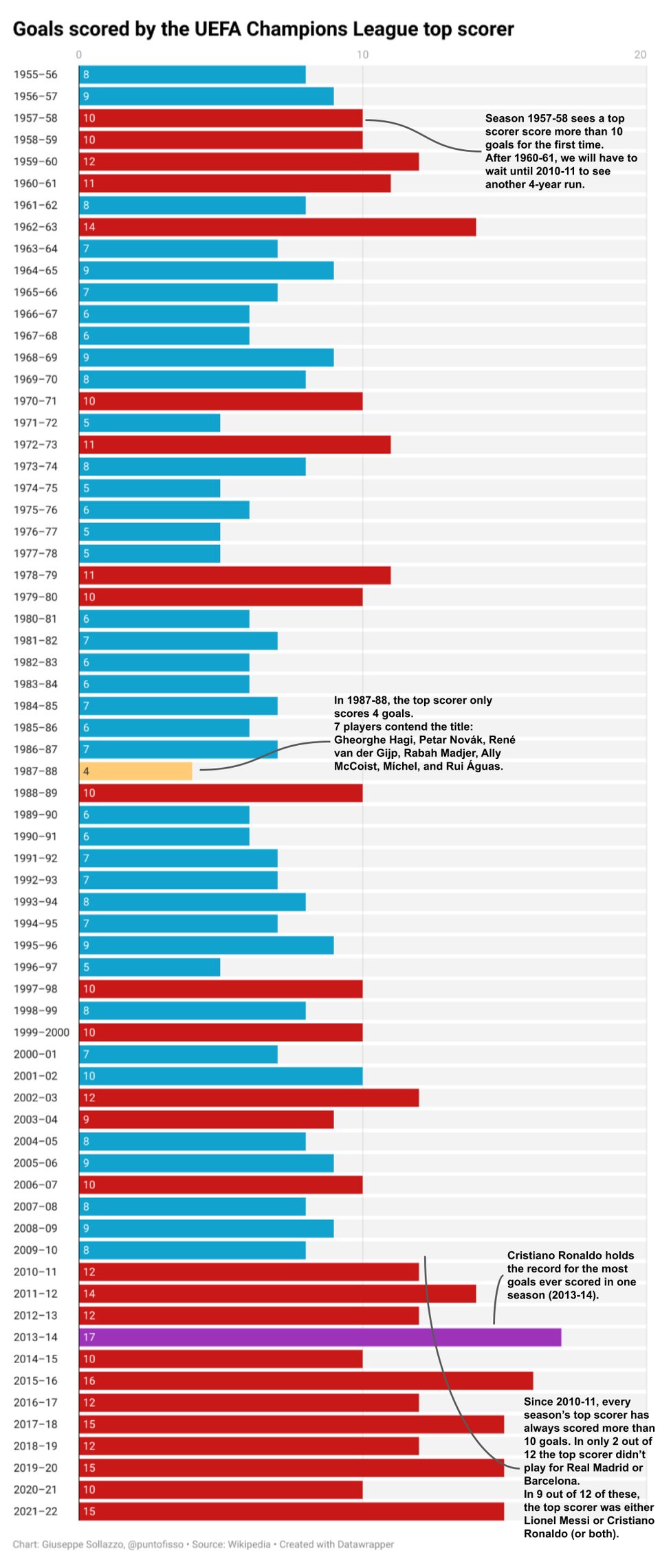
Although I'm not really a football fan (ok, I do watch world cups...) my attention was piqued by what looks like an extraordinary stat: since 2010-11 the UEFA Champions League top scorer has consistently scored more than 10 goals. Such a run has never happened before. So I visualized it using Datawrapper. A note: the expansion of the competition in the early 1990s did result in more games being played per team, but there is also a signal that starts in the 2010s. One to fully check for exercise, folks :-)
'till next week,
Giuseppe @puntofisso
|
DO YOU LIKE QUANTUM OF SOLLAZZO? BECOME A SUPPORTER! :) → If you enjoy this newsletter, you can support it by becoming a GitHub Sponsor. Or you can Buy Me a Coffee. I'll send you an Open Data Rottweiler sticker. You're receiving this email because you subscribed to Quantum of Sollazzo, a weekly newsletter covering all things data, written by Giuseppe Sollazzo (@puntofisso). If you have a product or service to promote and want to support this newsletter, you can sponsor an issue. |
✨ Topical
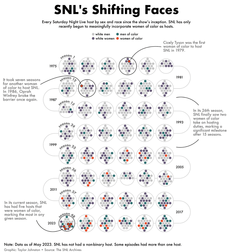
SNL's Shifting Faces
Taylor Johnston, featured in Quantum #456, looks at "the race and sex of every NBC Saturday Night Live host since the show began and found that SNL has only recently begun to incorporate women of color as hosts."
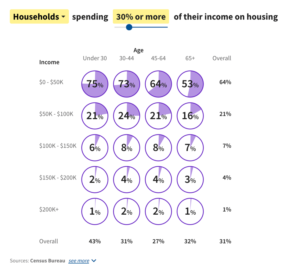
How much do Americans spend on housing?
"Half of renters spend at least 30% of their income on housing."
Pretty and very clear interactive charts.
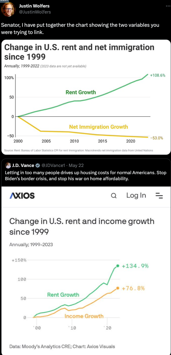
Journalist vs Senator
The Washington Post's Philip Bump captures in the How To Read This Chart newsletter, the highly interesting Twitter exchange between US Republican Senator J.D. Vance and Economics Professor Justin Wolfers. Aside from the mildly entertaining punch fight, it is interesting because it is about interpreting this chart by Axios, and how economics and politics use "evidence" in different ways when debating who and what is to blame for rent increases.
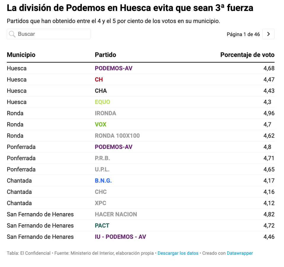
Arrasados por cinco votos: una lección de Huesca para la izquierda dividida
Original Spanish article here. From the automatic translation: "Devastated by five votes: a lesson from Huesca for the divided left – It is the city in Spain with the most parties on the threshold between 4-5% of the votes. The rupture of the confluences and the debacle of the PSOE gave the mayoralty to Lorena Orduna and Vox".
Enriched by maps and charts that use the unusually accurate electoral data that Spain offers.
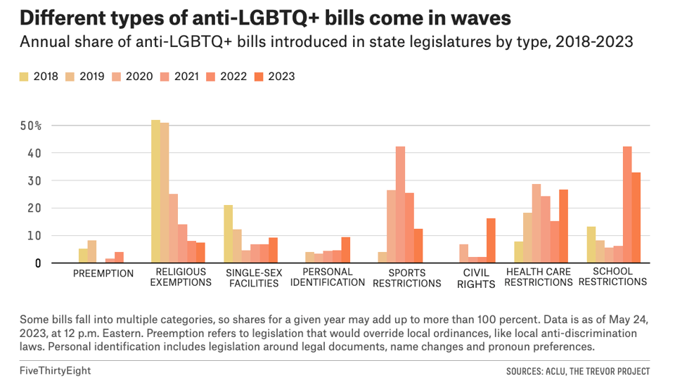
Over 100 Anti-LGBTQ+ Laws Passed In The Last Five Years — Half Of Them This Year
"Over the last five years, the number of anti-LGBTQ+ bills both introduced and passed into law at the state level has [exploded](https://fivethirtyeight.com/features/anti-lgbtq-laws-red-states/, according to a FiveThirtyEight analysis of data provided by the American Civil Liberties Union and The Trevor Project, a suicide prevention organization for LGBTQ+ youth."
🛠️📖 Tools & Tutorials

Every newsletter is exactly the same, until now, because The Smithee Letter is different.
It's a fictional narrative sales letter, like if David Lynch and Cormac McCarthy morphed into one person and wrote a weekly story about an anonymous salesperson on the run from dangerous people as they fall deeper and deeper down the rabbit hole of the strangest, most absurd parts of America. The story may be fiction, but the products are real. And the newsletter is free, all "Smithee" (because that's not their real name, of course) asks in return: Open the damn emails and click the damn links.
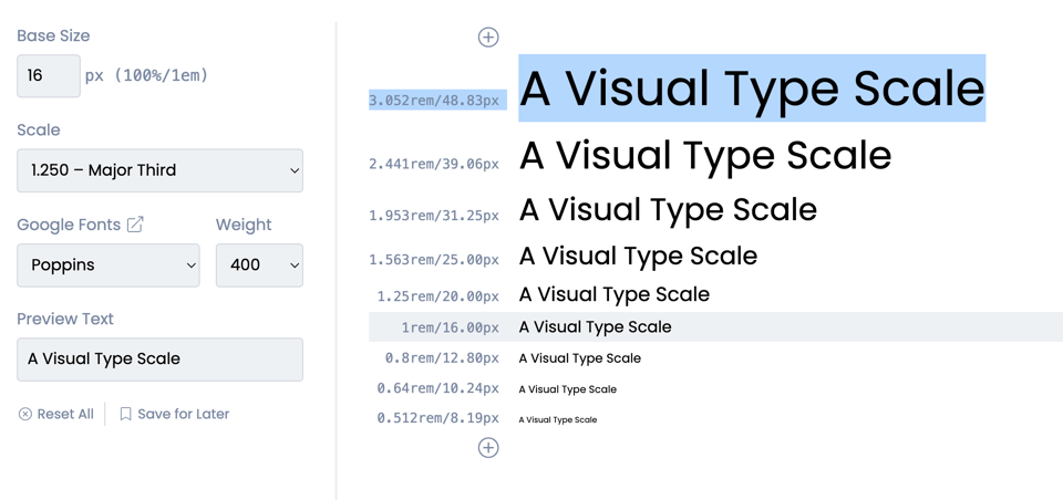
A visual Typescale
A type tool to test how different sizes of text/heading will display.
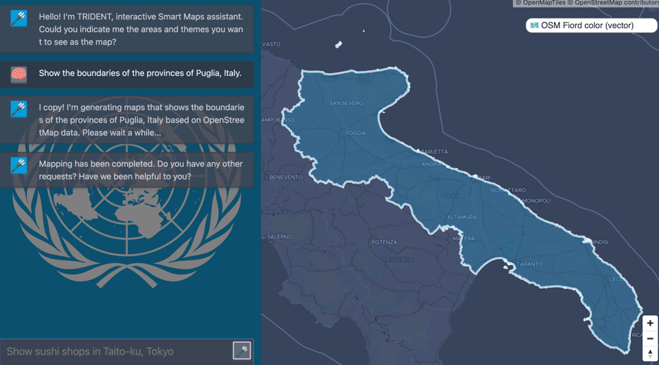
Hello! I'm TRIDENT, interactive Smart Maps assistant.
"Could you indicate me the areas and themes you want to see as the map?"
Using natural language queries to obtain geographical data from Open Street Map. It doesn't always work (like in the example below), but it's worth keeping an eye on it.
(via Maurizio Napolitano)
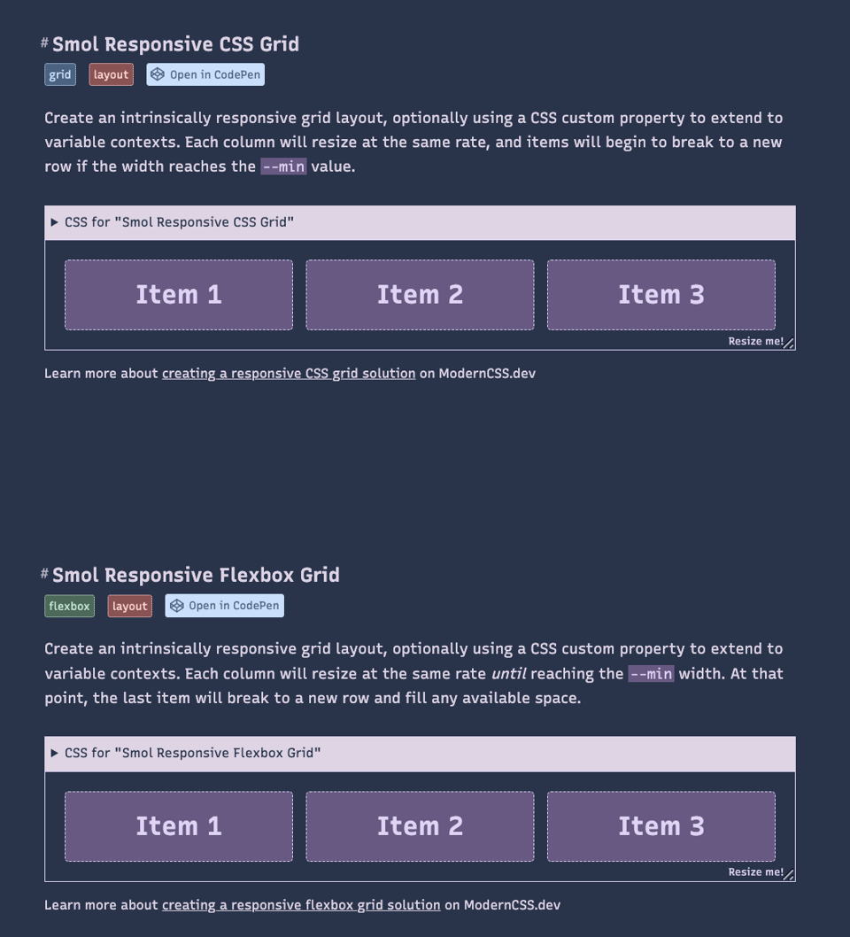
SmolCSS
"Minimal snippets for modern CSS layouts and components"
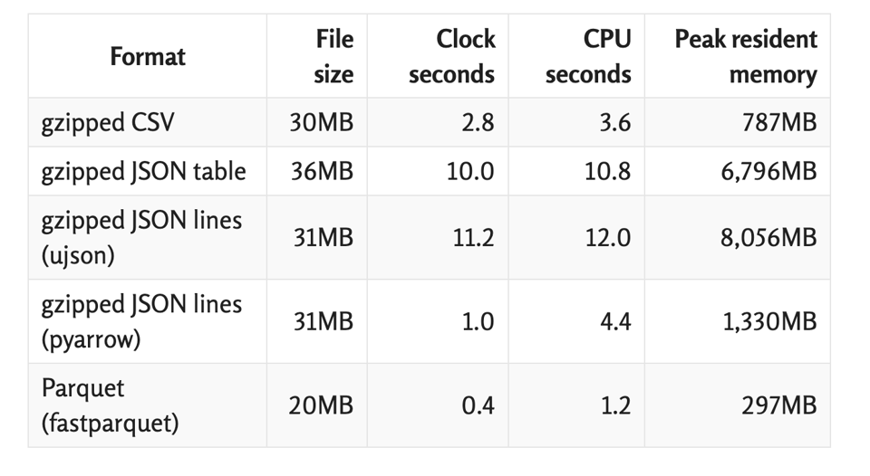
Choosing a good file format for Pandas
Itamar Turner-Trauring: "Before you can process your data with Pandas, you need to load it (from disk or remote storage). There are plenty of data formats supported by Pandas, from CSV, to JSON, to Parquet, and many others as well. [Which should you use?](https://pythonspeed.com/articles/best-file-format-for-pandas"
Labelling images for AI model training
I asked on LinkedIn and received a couple of very useful answers.
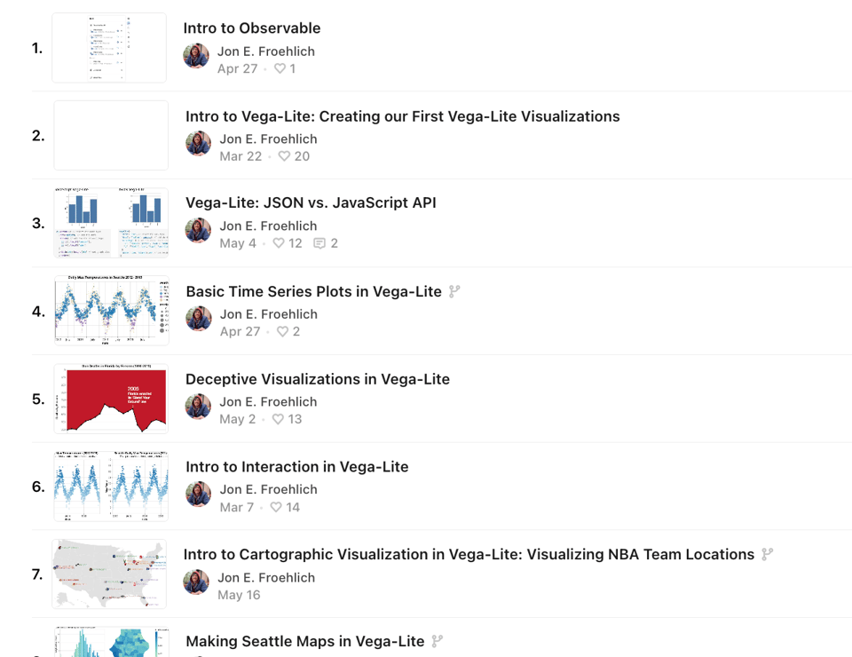
Intro to Vega-Lite
"A series of notebooks to introduce Vega-Lite in Observable."
Data-Science-Interview-Questions-Answers
Seven categories of interview Q&As by Data Science Writer Youssef Hosni.
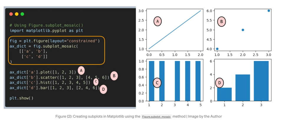
Simplifying subplots creation in Matplotlib
"If you’ve ever used the Matplotlib library, there’s a high chance you’ve also utilized its subplot functionality. Subplots are an effective tool for generating multiple plots simultaneously, which can be advantageous when comparing results or when multiple plots share identical axes. However, at times the subplot syntax in Matplotlib can be anything but straightforward for many of us, myself included. Achieving the desired layout for the subplots can seem like a game of trial and error, shifting the focus from our actual project."
This article suggests a simple solution.
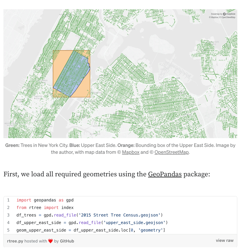
Speed up your Geospatial Data Analysis with R-Trees
"Learn how to drastically boost the performance of spatial searches".
"R-trees organize geographic information by partitioning the underlaying space into rectangles."
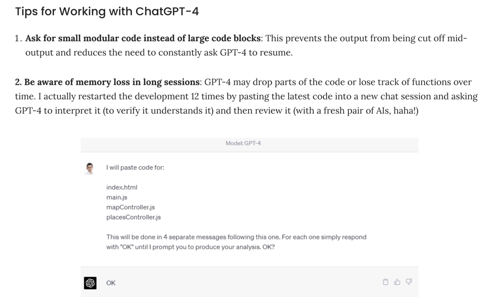
Building a Tour de France Beer Map With GPT-4: A Non-Developer’s Perspective
"The objective was to modify Google Maps to display the pubs with the cheapest beer at the end of each cycling stage. This article documents the challenges, lessons learned, and tips for working with GPT-4 in the process."
🤯 Data thinking
Software Bugs That Cause Real-World Harm
"Long story short: a software bug caused the machine to occasionally give radiation doses that were sometimes hundreds of times greater than normal, which could result in grave injury or death."
Many of these software bugs are data manipulation bugs.
📈Dataviz, Data Analysis, & Interactive
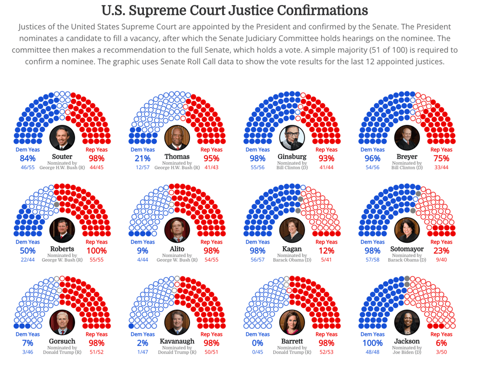
Supreme Court Justice Nominations
Tanya Shapiro: "Observable Plot recreation of a plot I created with R ggplot2 and supporting ggplot2 libraries. Data scraped from the U.S. Senate gov website using rvest."
ufo: an ultra-low frequency oscillator powered by the ISS
"UFO is a script for the Monome Norns - a kind of open-source musical gameboy with a tonne of amazing free scripts developed by the community."
One of Duncan's cool sonification projects.
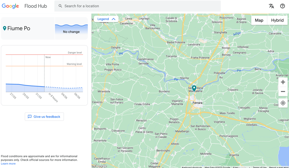
Flood Hub
Google is using AI to predict flooding. Will it work?
(via Massimo Conte)
osm-haiku
A website to "generate pointless haikus about a place from OpenStreetMap data".
I'm linking to this because the source code is available under a GPL licence and it's useful to understand how to interact with Open Street Map.
Decision Analysis and Trees in Python — The Sase of the Oakland A’s
"Using decision trees in Python to extract insight into the A’s decision to move to Las Vegas".
Code and data are here on Github.
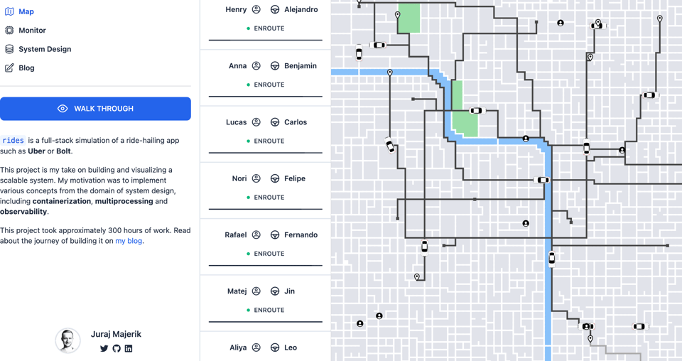
rides
rides is a full-stack simulation of a ride-hailing app such as Uber or Bolt.
🤖 AI
LM vs LM: Detecting Factual Errors via Cross Examination
In this academic pre-print the authors propose a system to fact-check claims made by ChatGPT-like language models that is based on a generator-discriminator multi-turn interaction.
Production AI systems are really hard
"No, AGI isn't going to take over every social system when GPT5 comes out"
What they don't tell you about A.I. Jobs Disruption?
"Women do not fare well in the future of work, or rather, traditional pink-collar type jobs."
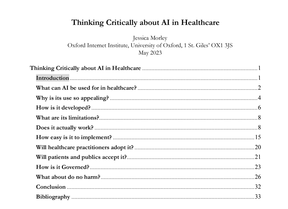
Thinking Critically about AI in Healthcare
A brilliant guide by Oxford Internet Institute researcher Jess Morley.
Lawyer cites fake cases invented by ChatGPT, judge is not amused
I've seen several takes on this ingenious (so to speak) idea by a US lawyer, but Simon Willison's is comprehensive on both the technical and the non-technical side.
quantum of sollazzo is supported by ProofRed's excellent proofreading. If you need high-quality copy editing or proofreading, head to http://proofred.co.uk. Oh, they also make really good explainer videos.

Supporters* Alex Trouteaud casperdcl / iterative.ai Naomi Penfold
[*] this is for all $5+/months Github sponsors. If you are one of those and don't appear here, please e-mail me