498: quantum of sollazzo
#498: quantum of sollazzo – 27 December 2022
The data newsletter by @puntofisso.

Hello, regular readers, and welcome, new ones! :)
This is Quantum of Sollazzo, the newsletter about all things data. I am Giuseppe Sollazzo, or @puntofisso. I’ve been sending this newsletter since 2012 to be a summary of all the articles with or about data that captured my attention over the previous week.
The newsletter is and will always (well, for as long as I can keep going!) be free, but you’re welcome to become a friend via the links below.
The most clicked link in issue 497 last week was to Alasdair Rae’s brilliant maps of working from home in England and Wales, 2011 vs 2021.
I hope your festive break is going great. See you in the new year.
‘till next week,
Giuseppe @puntofisso
|
Become a Friend of Quantum of Sollazzo from $1/month → If you enjoy this newsletter, you can support it by becoming a GitHub Sponsor. Or you can Buy Me a Coffee. I'll send you an Open Data Rottweiler sticker. You're receiving this email because you subscribed to Quantum of Sollazzo, a weekly newsletter covering all things data, written by Giuseppe Sollazzo (@puntofisso). If you have a product or service to promote and want to support this newsletter, you can sponsor an issue. |
✨ Topical
The top goal-scorers in elite club football since 1980
John Burn-Murdoch… strikes again.

Why the super rich are inevitable
A good visualisation suggesting that riches trickle up, not down, with some handy, customisable simulations.

Editor’s Pick: Top 10 Data Journalism Projects from 2022
GIJN’s choice of the best 10 ddj projects from this past year.
All I Want for Christmas Is … More Christmas Music
“Whether you consider it torture or treasure, blaring Christmas music has become a reliable part of the holiday shopping season.“
Bloomberg looks at the evolution of the use of Christmas music in shops, allegedly because it gets people to buy more.

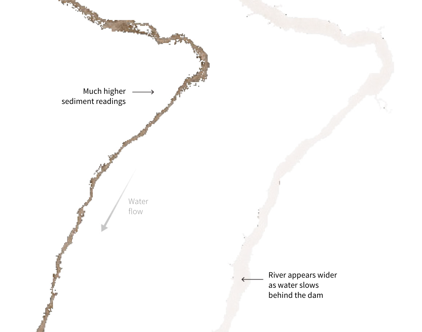
Starving the Mekong
“Lives are remade as dams built by China upstream deprive the Mekong River Delta of precious sediment.“
Reading this article, it becomes apparent that the prospects of peace and stability in the Mekong Delta area are not looking great.
The 16 numbers that shaped 2022
USAFacts’ “snapshot of 2022 in federal spending, elections, crime rates and more.“
🛠️📖 Tools & Tutorials
A Short Guide for Feature Engineering and Feature Selection
Although this guide is mostly aimed at Machine Learning pipelines, I think it will also be useful if you’re trying to do any type of data analysis that requires heavy data cleaning and calculations that go beyond the mere average/median/etc. Repository is here, with the TOC here.
OpenAI Cookbook
“This repository shares example code and example prompts for accomplishing common tasks with the OpenAI API.“
Make your own simple, public, searchable Twitter archive
“This is a static website that you can run. It is a website that takes in your Twitter archive zip file, in the format that it is provided circa December 2022, and generates a zip file with another website in it.“
Pixel Accurate Atkinson Dithering for Images in HTML
“There are other ways of crushing a multicolored image down to 1-bit monochrome but I think Atkinson’s method produces quite striking results that I thought would look neat on the modern web.“
I find dithering rather intriguing, for some reason. Dithered images have some interesting properties, including the fact that resizing ruins them way more than for non-dithered pictures.
The peculiarity of the approach in this article is that it is done in the UI thread (all code is here).


Going somewhere? Don’t forget Faye travel insurance
Next time you travel, make sure Faye is on board. Getting a custom quote for full-trip coverage takes under a minute online, and you can even file claims digitally in the Faye app for fast reimbursement. It’s all covered: whether your plans change before leaving or you experience in-trip hiccups like medical emergencies, lost luggage or flight delays, Faye takes care of travelers with real-time, 24/7 customer support. Plus, the easy-to-use app provides flight alerts, weather updates, COVID-19 destination info, and more.
🤯 Data thinking
Reading list: The top 5 must-read data blogs from 2022
Prukalpa Sankar’s favourite readings from 2022.
R packages for visualising spatial data
“Throughout the #30DayChartChallenge I made most of my maps with R. This blog post details the R packages I find myself using most often when visualising spatial data.“
Useful for next year?
On teaching how to code data visualizations
Thoughts from Benjamin Cooley, who taught two classes ( Visualization Technologies 1 and Visualization Technologies 2) at Northeastern University.
Failed ML Project - How bad is the real estate market getting?
“I made several mistakes in this machine learning project that led to its failure. I pick these apart in this article.“
📈Dataviz, Data Analysis, & Interactive
Weird & wonderful: Hungarian data graphics
A look at historic charts and maps about Hungary.
Pantone Panettone
“For Christmas I created mini panettone boxes designed as Pantone chips. Each box featured either a family member or coworker’s name, and a Pantone color reference number picked just for them.“
How could I not think of this before? :D
(via Duncan Geere)

How “See A Satellite Tonight” Works
“See A Satellite Tonight” is a pretty successful solo project by James Darpinian, who explains how he built it in this blog post.
Draw your neighborhood
“How do you define the neighborhoods in your city? Play our short interactive game to draw neighborhood boundaries and compare your answers to other Axios Local readers.“
Nice and interactive! I really don’t know San Francisco…

No more white Christmas?
“With this year’s holiday approaching, I was wondering if I had ever witnessed a real white Christmas”, says Simon Jockers from Datawrapper.
The Guardian, similarly, looks at the increasingly small amount of snow over the Christmas period in Britain: from 57 white Christmases all over the UK in the 1960, to 8 in the 2010s.

2022 FIFA World Cup
I absolutely love these minimalistic animated visualizations of football matches by Krisztina Szucs.

🤖 AI
Blueprints for intelligence
“A visual history of artificial neural networks from 1943 to 2020.“

10 AI Predictions For 2023
Web Archive link to make sure you all check if they got it right next year ;-)
Do Simpler Machine Learning Models Exist and How Can We Find Them?
Some interesting reflections and a debate.
“If I’m doing adjustment for survey nonresponse or imbalance in an experiment, I find a more complicated model to be more interpretable and explainable: if I use a simpler model, it can be harder to explain.“
The original talk that sparked this short article is captured in this YouTube video.
quantum of sollazzo is supported by ProofRed‘s excellent proofreading. If you need high-quality copy editing or proofreading.
Thanks to GitHub Sponsors casperdcl and iterative.ai, Jeff Wilson, Fay Simcock, Naomi Penfold