Letters from the Future
MUTATION VECTORS
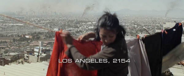
A still from Elysium via Typeset in the Future.
Status Update
Hello from the Columbia Ridge. It’s flooding out east, but we’re nice and dry here. Since last I wrote you, we’ve gone from “I guess we’re at war with Iran?” to “Whatever happened to that thing with Iran?” Impeachment and the Iowa caucus have come and gone. And we’re still here.
Writing Elsewhere
I profiled Sahil Lavingia, the founder of e-commerce site Gumroad, for WIRED, and his journey from being a wannabe billionaire to the proprietor of a small but sustainable business.
… and about the battle over the future of .org domain names, which has now attracted the attention of California attorney general Xavier Becerra.
Typomania
I have an intermittent case of what Erik Spiekermann calls typomania. I get where I have a hard time reading, because I’m just looking at the type, trying to admiring the curves and angles, trying to figure out what typeface is being used. I can go years and years where I don’t pay much attention at all to type. I’ll notice whether something is serifed or san serifed, or maybe notice really obvious font choices. In fact, I didn’t even know what fonts the various website templates I’ve used over the past several years actually used. I only just realized that this newsletter had been set in Arial since I switched over to Buttondown. Now it should appear in your browser or email client’s default sans-serif font, which is probably still Arial if you’re using a web browser on Windows or MacOS. Otherwise, I think it will be Roboto if you’re using Gmail on an Android phone and San Francisco if you’re using an iPhone. I set Trebuchet as my default sans serif font, which is a controversial choice, but it’s what I personally find most readable on screen.
Anyway, yeah, I’ve sure got typomania bad right now. I’m no graphic designer, but as someone who makes a living reading and writing text, I feel like it makes some sense to pay attention to what that text is made out of. It feels like I’m privy to some secret language, able to see messages and history that no one else can see. I won’t detail all the various connections between writing and magic (the double meaning of the word “spell,” the relationship between the words “grammar” and “grimoire,” etc.), but suffice it to say that in the ancient world, literacy would have been indistinguishable from magic. The more I stare at the shapes and forms of letters, the less distinguishable letters are from magic even today. As Robert Bringhurst, author of Elements of Typographic Style, wrote: “Letters have a life and a dignity of their own.”
Letters from the Future Part 1: Eurostile
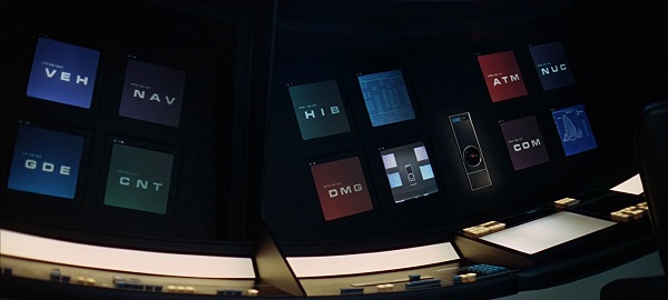
Above: A still from 2001: Space Odyssey via Typeset in the Future.
The Bauer Type Foundry released Paul Renner’s typeface Futura in 1927. It’s still strikingly contemporary 93 years later. Perennially modern. but not futuristic. Microgramma, released in 1952, and its successor typeface Eurostile, on the other hand, both look perennially futuristic.
The face has seen continuous use in science fiction, as documented by Dave Addey’s website and book Typeset in the Future, from 2001: A Space Odyssey to present. It shows up in Dr. Who, Thunderbirds, THX-1138, various Star Trek media, Aliens, Back to the Future, Red Dwarf, Hackers, Johnny Mnemonic, Wall-E, District 9, Pacific Rim, Elysium, and the Marvel universe movies. It was on the cover of the 1972 Penguin paperback edition of Clockwork Orange, at least a few editions of various J.G. Ballard novels (including Atrocity Exhibition and Crystal World), at least the first edition of Neuromancer. It’s used for the wordmarks of Casio, the Roland Juno, and, weirdly enough, Halliburton and WWE Raw. It was used on Commodore computer keyboards, to Moog Prodigy control labels, and car dashboards. Radiohead used it on the OK Computer and The Bends album covers. Metallica used it for Master of Puppets. That’s just a few things from Wikipedia (and a little extra digging for the book covers). Apparently Eurostile is second only to Helvetica for typesetting sci-fi user interfaces.
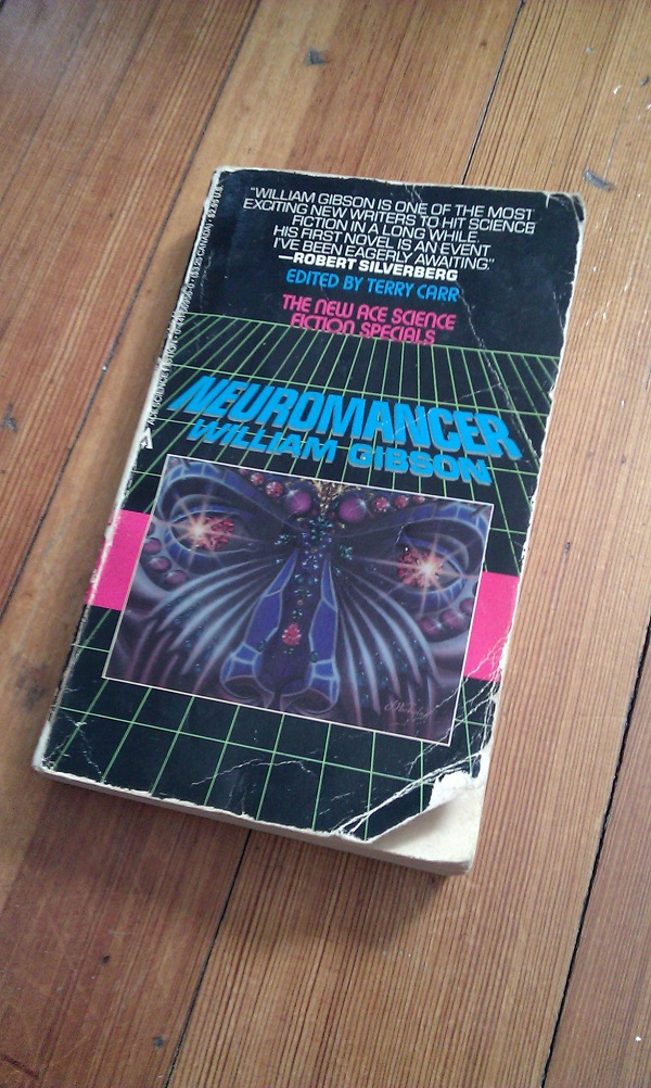
Above: the cover of the first edition of Neuromancer by William Gibson via Rob Larsen.
It may be overused, but Eurostile is a shorthand for futurity and technology that just hasn’t really gone out style the way old computer-style typefaces like, well, Computer have. Maybe that’s because of the constant reinforcement. But I wonder if it has something to do with the design of the typeface itself. I haven’t been able to learn whether the designers of Microgramma and Eurostile intended them to be used as futuristic display typefaces. Addey’s book may have more information, but I don’t have it yet.
Aldo Novarese is generally credited as the designer of Eurostile, but according to the Linotype Company’s write-up on the Eurostile Next font, the uppercase letters were drawn by Novarese’s mentor Alessandro Butti for Microgramma. In other words, the parts of Eurostile that we’re all most familiar with, the numbers and uppercase letters, were most likely created by Butti. Novarese added the lowercase letters to create Eurostile.
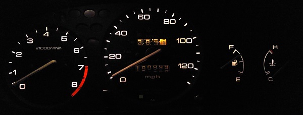
Above: A 1997 Honda Civic dashboard via Fontsinuse.
There’s very little information about Novarese on the internet. The most I can find is a short biography on the site TypeNetwork website. He was born in Pontestura, Italy in 1920 and died in Turin in 1995. He was drafted into World War II. He was arrested for protesting the draft, but was spared harsh punishment because “he had won a gold medal in the Ludi Juveniles, a celebration of Fascist culture, sport, and art.” Later he joined the American-led resistance. “By his own account, he was captured by the Germans and shot, along with other partisans,” TypeNetwork reports. “But he survived, hiding out for two days under the dead bodies of his comrades.”
I’ve been able to find even less about Butti, but this page has some nice examples of his work.
Pretty much everyone who writes about Eurostile/Microgramma notes the similarity between the typeface’s rounded corners and the design of 1950s television sets. I don’t know whether that was deliberate on the part of the designers, or whether Eurostile was originally marketed as futuristic (was “futuristic” what whoever typeset the covers of _The Autobiography of Malcom X or this Miles Davis live album were going for?). But if they did it seems like a good decision. The computer terminal inspired typefaces of the 60s and 70s, like Data 70, all look dated now because computers got much better at displaying type. But although my monitor and television have squared corners, my laptops and iPhone all still have rounded corners even though the screens themselves are squared. Maybe Eurostile still looks futuristic because Butti and Novarese opted to base their design on a more enduring industrial design pattern.
Context probably matters here as well. There are plenty of examples of Eurostile looking utterly mundane on Fonts in Use. I had breakfast recently at a place that typeset their menu in Eurostile. It doesn’t look particularly futuristic, nor did my companions notice anything special about the menu’s text until I pointed it out.
That’s a strong point of Eurostile: it’s subtle. Once you know what to look for, you’ll see it everywhere. But it doesn’t stand-out as an overtly futuristic font the way, say, Orbitron or the Ferrite Core does. It doesn’t scream “This is the future!” You just know it when you see it.
Below: A still from The Fly via Typeset in the Future.
A few reads on typography
-
Which Are More Legible: Serif or Sans Serif Typefaces? Spoiler: neither one, despite widespread belief that serif fonts are more legible in print or for long passages and that sans-serif fonts are best for digital displays. I do personally find that though serif fonts look great on my HiDPI displays like my phone and laptop screens, I find text is still often at least a little blurry on my external monitor. I find that slab serif fonts and sans serif fonts end up looking better. That doesn’t mean that slightly blurrier serif fonts are less legible or readable, but I do find it distracting.
-
Typography and Dyslexia Another widespread myth is that certain fonts, such as Comic Sans or Dyslexie, are better for people with dyslexia. But evidence doesn’t support that claim either. Much like general readability and legibility, font size and spacing are more important. As if to illustrate that point, this article looks poorly typeset to me: it has too much space between lines.
-
The Last Word on Helvetica I like this article because it calls out Arial haters:
Most Arial haters (and they outnumber Helvetica haters 100:1) would, especially once the most differentiated glyphs are removed, be hard-pressed to tell it apart from Helvetica. At least if you are going to hate, then do so consistently. In my opinion, if you hate Arial (and hate really is too strong a verb/noun for discussions about digital typefaces), then you are vicariously hating on Helvetica, whether you like it or not.
So much typography advice is more about impressing other designers than serving readers. See this advice from Matthew Butterick’s Practical Typography, for example, about not using Minion. Butterick doesn’t recommend against Minion because it’s a bad font. Bringhurst’s Elements of Typographic Style is set entirely in Minion for crying out loud. It’s not even all that overexposed. It ties for tenth in this tally of the top 20 most commonly used typefaces used in books from major publishers in the past 20 years, doesn’t crack the top 10 most commonly used newspaper fonts. Rather, he recommends against it because it’s the default font in Adobe products and using the defaults is bad, ok?
Few people are ever going to notice a difference between Helvetica, Arial, and Akzidenz Grotesk, even subconsciously.
- Well, I say that, but Errol Morris (yes, that Errol Morris) conducted an experiment where he found that people were more likely to agree with a survey if it was set in Baskerville than other typefaces, including another fairly straight-laced serif font called Georgia. So maybe people notice typography more than I, or they, realize. Then again, Georgia and Baskerville are more different from each other than Arial, Helvetica, and Akzidenz are from each other. Besides, I’m not sure this experiment really proves anything. But it probably wouldn’t hurt to set your persuasive writing in Baskerville, especially since there’s a fantastic free and open source implementation called Liber Baskerville.
Media Diet
Browsing
-
Fivethirtyeight: New Hampshire Votes In Three Days. Many Voters Could Still Switch Candidates. Of course it’s less than three days now. Undecided voters is a big part of what made the 2016 presidential election so hard to call. I don’t know if that was a factor in the somewhat surprising results in Iowa as well but I wouldn’t be surprised.
-
My wife and I spent a brief amount of time in Sihanoukville during our trip to Cambodia last year and were both a little haunted by the place. It’s full of big, apparently empty newish buildings and utterly bombed out roads. Cambodia is a pretty literally post-apocalyptic country–the genocide wiped out perhaps a quarter of its population. Still, the state of Sihanoukville was puzzling. This article from the Southeast Asian Globe goes some way towards explaining what’s going on there.
-
This article, meanwhile, gives an overview of the state of Cambodian politics.
-
Via the above, IDEA’s Global State of Democracy Report 2019 finds that although the number of democratic countries has increased from 26 percent of all countries in 1975 to 62 percent of all countries in 2018 (assuming you accept IDEA’s criteria for what counts as a democracy), the number of countries experiencing “democratic erosion” has more than doubled in the past decade. I haven’t had a chance to really dig into this report yet, but it’s full of interesting information.
Books
I started Elements of Typographic Style and William Gibson’s Agency (the cover of which is set in Akzidenz Grotesk, the chapter headers in Gotham, and the text in Adobe Garamond with an occasional bit of Helvetica). But two library holds came in: Never Use Futura (set Neufville Digital’s version of Futura, with body text in Lyon) and The Water Dancer by Ta-Nehisi Coates (the cover is set in the trendy Harbour, while the body is set in what looks like Adobe Caslon to me). I’m also listening to the audio book of The Men We Reaped by Jesmyn Ward.
Music
We saw the doom metal duo Year of the Cobra again a few weeks ago, and their live game leveled up since we saw them last summer. And it turns out they released a new album, Ash And Dust, last November that I’d missed. They more than leveled up their recording game, delivering something more on par with their live shows. Most recommended.
Logoff
Well, that’s quite enough out of me for a while.