Inspired By #9

Hello hello!
Welcome to the 9th issue of Inspired By. I saw a lot of nice thing this week. Let’s get to it...
— JP
🇺🇸 GT America
“GT America builds a bridge between the American Gothic and European Grotesque typeface genres.” Whatever that means, I like this versatile super family with many width, from compressed to mono and expanded. See it in use at the 🔝 of this issue.
GT America â 84 Style Swiss-American Grotesque Font Family â Download Free Trial Fonts
GT America builds a bridge between the American Gothic and European Grotesque typeface genres. It combines design features from both traditions and unites them in a contemporary family. Exclusively available at Grilli Type.
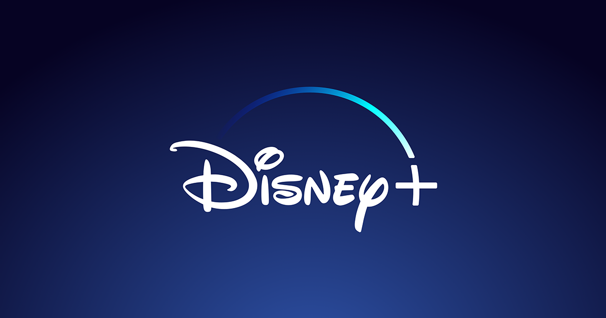
🏰 Disney+ Launched!
With new content like The Mandalorian, The World According to Jeff Goldblum and The Imagineering Story Disney+ is off to a great start (and had 10 million subscribers on the first day 😳)
Stream Disney, Marvel, Pixar, Star Wars, National Geographic | Disney+
Disney+ is the home for your favorite movies and TV shows from Disney, Pixar, Marvel, Star Wars, and National Geographic. Sign up for Disney+ and start streaming today.
🥰 Recursive by Arrow Type
A highly-flexible new variable font, with another really cool and detailed one-pager. Can’t wait to try it out.
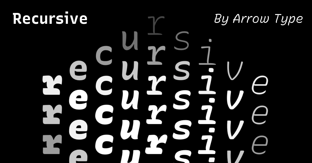
Recursive Sans & Mono
A highly-flexible variable font for design, code, and UI.
🎩 Typographic Illusions
Did you see that episode on Typography of the Netflix documentary “Abstract: The Art of Design”? Remember those short lessons on optical illusions in Typeface design? Jonathan Hoefler published those and six additional lessons that didn’t make the cut.
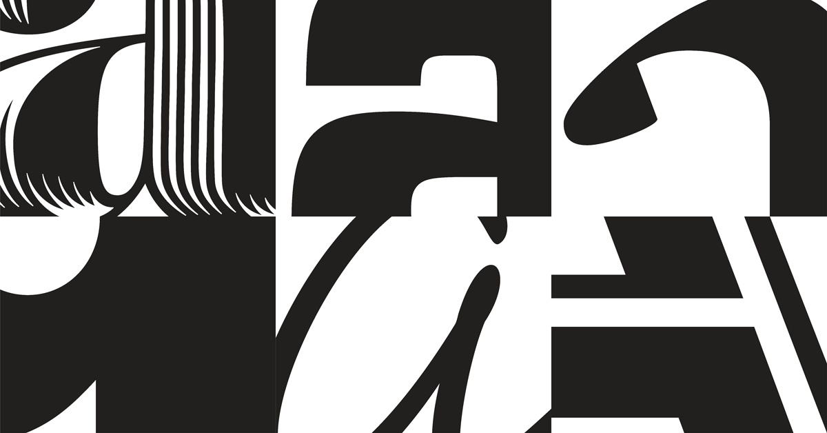
Fonts by Hoefler&Co.
H&Co designs fonts for print, web, and mobile environments.
🐋 Strokes & Dots
Ruben’s drawings are inspired by 19th century natural history illustrations. And are made of dots. A lot of dots.
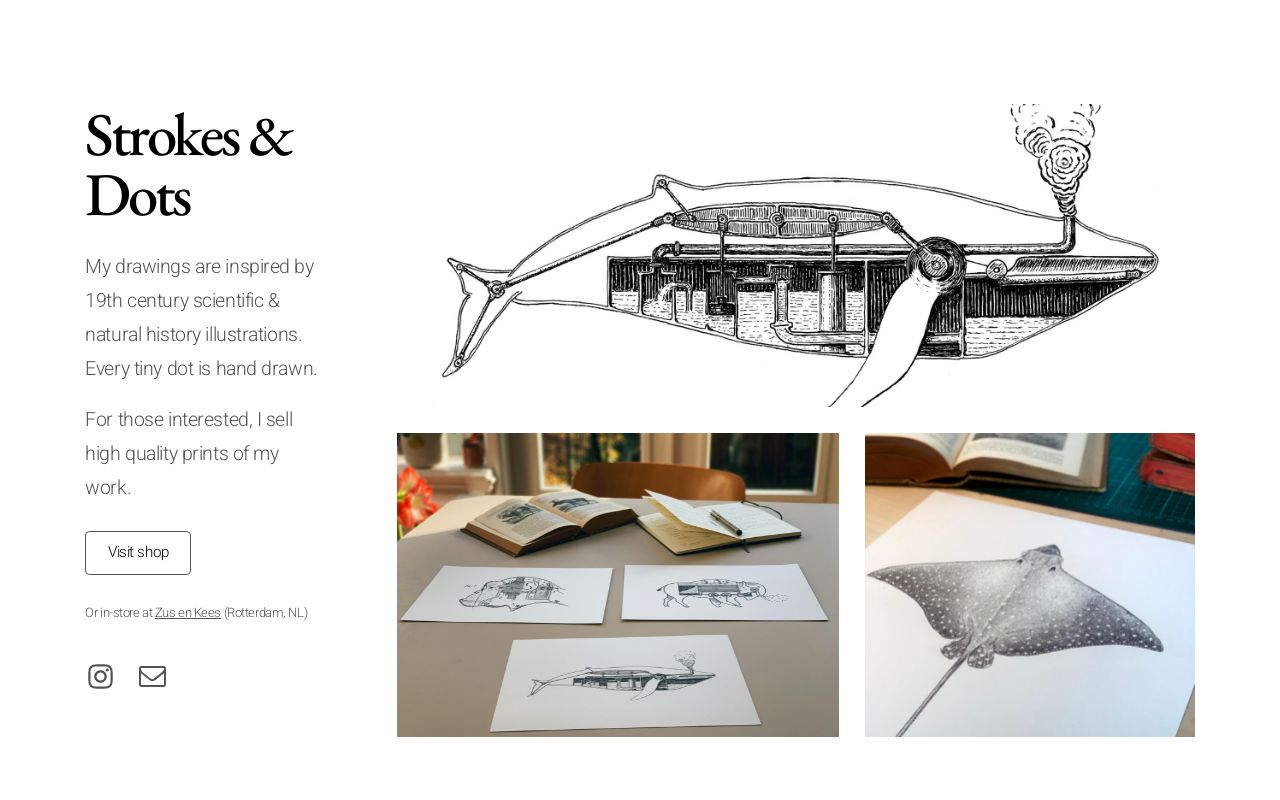
Strokes & Dots
My drawings are inspired by 19th century natural history illustrations. And are made of dots. A lot of dots.
🃏 Carrd
Simple, free, fully responsive one-page sites for pretty much anything. (Via Ruben, who built Strokes & Dots with it)
🦔 Sonic the Hedgehog
A few months ago the internet freaked out about the way Sonic looked in the upcoming movie. So, they redesigned him! Check out the New Sonic in this new trailer:

👺 Benguiat Montage by House Industries
Yup. Fonts have trailers now! Originally designed for Photo-Lettering in the mid-1960s by type legend, Ed Benguiat, House Industries has remastered the films into a robust font family ready to tackle any challenge you can throw at it.
http://hello.houseind.com/work/montage/🚗 30 Years In The Making
A car commercial that made me cry! 😭 (seriously, this is a beautiful short movie)

That’s all for the 9th issue of Inspired By. Hope you liked it and see you next time!
