Adventures in Typography

Archive

💀 Color Fonts Are Dead (Not really, but kinda)

adventures-banner.jpg


Sorry for being so political here, but: color fonts are beautiful.

Back in 2014, Roel Nieskens wrote a blog post called Colorful typography on the web where he argued that web typography would soon get much more interesting with a whole new font format: color fonts. Back then we couldn’t change parts of a font or highlight one part of a letter in a specific color and so a few formats popped up to solve that problem, all of them described as “color fonts” though.

October 24, 2022
Read more

🔠 The Shackles of the Baseline

Friends! Chooms! Ayer Deck Appreciators!

example-99.png

The most embarrassing thing about this here newsletter is my limited field of view: topics range from Latin-based scripts to Latin-based scripts. If you speak English, German, French, Italian, or Spanish, then don’t worry, I’ve got you. But this newsletter makes out as if other languages simply don’t exist. This is wrong! And short-sighted! And…kinda mean!

That’s why I got so excited when I saw that Pooja Saxena recently started a great newsletter called I Spy with my Typographic Eye. Pooja—aka Matra Type—is a type designer and letterer specializing in Indic scripts such as Devanagari, working alongside the excellent folks at TypeTogether.

October 2, 2022
Read more

🔠 Always Read the Specimen

Friends!

example2.jpg

‘A’ from Elfreth with Service Gothic’s manicules


September 25, 2022
Read more

🔠 “Negatively Spaced Within a Pica Of Its Life”

Type pals!

Robin here. Last week I mentioned that I should just write the damn book and so I’ve decided to get to it. I’m kicking off a brand new project and weekly newsletter so that you can follow along with my progress.

It’s called How Not To Make a Book. Go subscribe!

hntmab.png

September 4, 2022
Read more

🔠 Just Make the Damn Book

Friends! Colleagues! Typophiles!

alphabet 1.png

Here’s some beautiful lettering by Ukranian type designers Victoria and Vitalina Lopukhina, as spotted in this fantastic Alphabettes post. Look at the extended leg of that K! This proves my theory that typography is more punk than punk rock.

But, this week, a revelation: what if I stop talking about it and just make the damn book?

August 27, 2022
Read more

🔠 The Bizarre Bodoni Bastard

CleanShot 2022-08-14 at 10.43.26@2x.png

Friends!

This weekend I fell into a Pyte Foundry shaped rabbit hole, trawling through everything that Ellmer Stefan has ever made. For the last few hours I’ve been excavating the weirdest of wonders in the dark, and now I’m thoroughly stuck. What lured me into this hole was Kinckq, a typeface that Ellmer describes as “a digital reanimation of a unique brainchild emerging from the pantographically distorted minds of North American wood type manufacturers.”

Here’s what those words mean in practice:

August 14, 2022
Read more

🔠 Typography as Time Travel

“When I look at a Victorian type specimen book, I feel like time flattens out.” writes David Jonathan Ross for his Font of the Month Club.

“I’ll catch the 1880 vibes, for sure, but also whiffs of 1970 and 2022. I’ll see frilly fonts on one page that feel hopelessly antiquated, relics of a bygone era. Next to them, I’ll see fonts that feel strikingly contemporary, virtually indistinguishable from what’s popular today. It’s funny to see them coexist, and it reminds me of how limited my definition of ‘contemporary’ can be.”

I have two thoughts here. First off, I love Ross’s latest typeface Glyptic.

adventures.jpg

August 7, 2022
Read more

🔠 Anaheim

Friends!

It’s my birthday today, I’m 32 years old, and I’m sitting in the heartland of America, the very center/centre of this country; a nondescript hotel in a city made of hotels, Anaheim, California. I’m here for Disneyland.

After crossing the little gate yesterday into the happiest place on Earth I found the scale of this grand illusion to be utterly mind boggling. And no matter how cynical you might be, no matter how goth you are, there’s not a cynic alive who can walk down Main Street without a big dumb smile on their face. It’s simply impossible.

So here’s a short one for you all today in celebration of some tiny type things that I spotted in Disneyland today. Next weekend I’ll be back for hot takes and more typographic drama. I’ll see you then.

July 26, 2022
Read more

🔠 The Art of Emphasis

Allo allo!

It’s me, Robin Rendle, and this is Adventures in Typography. It’s been a while! I took a year-long break but now I figure it’s time to rant about fonts again. So from July to December I’ll be writing this newsletter once a week.

Prepare yourselves. You cannot escape.


July 18, 2022
Read more

🔠 Pirate Fonts

Pals!

When it comes to typography, my tastes fluctuate and change over time. Sometimes I want loud interfaces, buck-wild swashes, and daring shapes that shove me about and challenge me. Other times I admire subtlety and caution; I want a typeface that looks like a professor all buttoned up, hands firmly in pockets.

But for the past month or so I‘ve been looking at a series of utterly bonkers typefaces that are not the usual pristine, posh, and fancy things that catch my eye. I‘ve found myself drawn to typefaces such as Adams Regular and .

March 14, 2021
Read more

🔠 What makes a typeface good?

Comrades!

This week two things caught my eye.

First up: Codelia by Toshi Omagari which is described as a “monospaced humanist sans” on and more accurately described by me as a “heck yeah” font. Just look at this thing and all it’s extreme heck yeah-ness:

March 8, 2021
Read more

🔠 A Picture of a Thing

Friends!

This week I have no rant, only homework.

After I wrote about Columba last month I fell down a rabbit hole and read this excellent post by the designer Lewis Mcguffie called . It’s about the difficulties of designing type, sure, but really—secretly—it’s about understanding scale when working on a big project:

February 22, 2021
Read more

🔠 The Homepage is a Nightmare

Friends!

Okay so I had a really good idea for the homepage last night. Well. Maybe. Let’s see. It all began when I mentioned in the CSS-Tricks newsletter the other day that designing a homepage of a website is the single most impossible thing in the universe:

February 15, 2021
Read more

🔠 Connections

Friends!

I’m sat at my desk and it’s a cold morning here in Bernal Heights. But before you begin to worry too much about me—fear not!—it’s important to note that despite my nose being cold and my focus wondering all over the darn place, I have drunk at least a gallon of coffee and propped up in front of me is Keith Houston’s book about books called—somewhat mysteriously—.

February 7, 2021
Read more

🔠 Kickflip Typography

Friends!

I don’t understand why. Just. .

February 1, 2021
Read more

🔠 Why do you care so much about fonts?

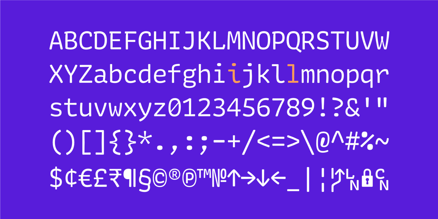
The curious shapes of Almost by Jérôme Knebusch caught my eye last week when I read Laura Meseguer’s review.

January 23, 2021
Read more

🔠 Newsletters

Wood engraving by Julien Turgan, 1875


January 17, 2021
Read more

🔠 Let Fonts Be Fonts

Pals!

The website for GT Flexa is wondrous; enormous animations, pitch-perfect typesetting, and with writing that doesn’t make me want to walk into the nearest ocean. The combination of these things shows just how much laser-like focus was trained on these letters but they also tell a galloping story about how the designers wanted their typeface to be as flexible as possible:

August 29, 2020
Read more

🔠 Continental Types

Friends!

Did you know that you can buy type specimens? If you leave the Darkest Web behind and hop onto the Loveliest, Sweetest Web you’ll find a treasure trove of graphic design and typesetting—the likes of which you’ve never seen before.

Ah, but where are my manners? Let me re-introduce myself. I’m Robin Rendle and you’re receiving this newsletter because you subscribed to it some time ago. I took something of a hiatus recently but am now returning for Season 3 of Adventures in Typography.

Let’s make a big mess together and talk about fonts.

August 17, 2020
Read more

🔠 Do justice and let the skies fall

Friends, comrades.

is on hiatus right now but let’s get right to it: there are organizations that need our help. There are people out there doing hard work and fighting like hell. And here’s one small way you can help them:

June 5, 2020
Read more

🔠 Typographic Superhighway

Comrades!

This is Adventures in Typography, a newsletter all about typefaces and fonts and what those words really mean, written by your friendly-neighborhood-lowercase-k-enthusiast Robin Rendle.


May 16, 2020
Read more

🔠 What text can really be

Friends! Pals! Adoring fans!


This is Adventures in Typography, a newsletter all about typefaces and fonts and what those words really mean, written by your friendly neighborhood .woff enthusiast Robin Rendle.

May 6, 2020
Read more

🔠 Oh boy, I have opinions about things!

Friends! Comrades! .woff enthusiasts!


This is Adventures in Typography, a newsletter from me, Robin Rendle, all about typefaces and fonts and what those two words mean.


April 26, 2020
Read more

🔠 The Infinite Remix

Friends!


This is the latest edition of Adventures in Typography, a newsletter by your friendly neighborhood blogger, Robin Rendle.

April 10, 2020
Read more

🔠 Ghosts V–VI

Pals!


This is Adventures in Typography a newsletter by your friendly neighborhood blogger, Robin Rendle.

March 28, 2020
Read more

🔠 We’re not on a ladder here. We’re on a web.

Friends!

Pedantry can be found everywhere and in all things, but especially in typography. Previously I’ve written about how our field is used to belittle people and how the subject is weaponized by a small band of rogue pillocks:

March 23, 2020
Read more

🔠 A Wonky Sleight of Hand

Friends!

Look closely at a good typeface, with your nose touching the paper or the screen, and things will get weird. The black/white/space/counterspace of each letter will soon evaporate until there’s only one thing you’ll be able to notice: the sleight of hand that is great type design.

For example, by Commercial Type has been sitting in my Mega Font Spreadsheet for quite some time—and I know I’ve mentioned how lovely it is before—but earlier in the week I pulled the ripcord and with it in mind. Why did I use Ayer? I’m not so sure. The letterforms have a hard-to-describe sort of bumbling elegance to them. Each letter is beautiful but they have a wonky power that I want to bottle up and pass around. I reckon that’s because so many websites are and —descriptions of work in the third person, blog posts that have a tone that is ughhhhh and sometimes ehhhhhh.

March 19, 2020
Read more

🔠 Behold the Glorious FAQ

Friends!

The plan was nothing short of genius.

I had waited all day for the British summer afternoon to yawn, stretch, and then finally slip away, until my father’s downstairs office was completely empty. Another hour passes, just in case, until I can’t wait any longer: a quick hop down the stairs, a mad dash across the hallway, and bang, zip, zoom—I’m standing in the office where my father had just installed AOL on a patchy dial-up network. Easy.

Amidst all the cables and office equipment, I fumble around in the dark beneath his desk. I find the power button and a whirlwind of noise bursts from the computer—startling me—and now my head is truly and thoroughly bumped. Internet rattling! Discs spinning! This was an ancient time before computers became wafer-thin mirrors of quiet glass, when every desktop was a furnace of hot air and clunking, monstrous parts. I had to be quick.

March 4, 2020
Read more

🔠 Blackletter type

Friends! Compatriots! And blackletter fans!

Earlier in the week I was watching and surfing the net for fonts (as you do). But during that beautiful opening crawl I had somehow found myself struck dumb by a series of blackletter typefaces, and particularly by Elfreth. It’s a family designed by James Hultquist-Todd and published via his foundry .

February 26, 2020
Read more

🔠 8 x 8

Pixelated pals!

When reading Toshi Omagari’s book Arcade Game Typography it’s hard not think about just how big Typography—with a capital letter T—truly is. I’ve been on the outskirts of the industry for more than a decade now as a web designer (without mentioning this peculiar role as a pseudo font-journalist) and yet there’s always buckets more to learn. Just as you think you’re confident there’s nothing left in the subject to draw a gasp from you, there it is.

— gasp!

February 6, 2020
Read more

🔠 Foundry websites

Pals! Acquaintances! Friends whom I am eternally jealous of because your hair is cooler than mine!

Over the past few weeks there’s been an absolute barrage of new type websites and each of them has left me utterly bamboozled. I have approximately ten thousand tabs open at any one time and, not only that, but the standard of these websites now appears to be at an all time high. Each of them happen to be striking and animated—all appear to be taking inspiration from each other without ever outright stealing each other’s ideas. And so I feel like we’ve entered a new golden age of pairing type and web design together.

Anyway, the first one I want to ramble about is the redesigned Occupant Fonts website as it happens to look like this:

January 25, 2020
Read more

🔠 Systems, Mistakes, and the Sea

Friends! Chums! Mates!

It might be the start of a new year but I will never quit my rambling nonsense: over the holidays I wrote a piece about design systems and the field of web design called Systems, Mistakes, and the Sea. I argue that everyone in the field is, well, pretty dang frightened to tell the truth about their work and how it’s extremely difficult building software at scale.

It also gave me the opportunity to do a bit of typesetting and I set myself a rule as I began designing it. I only wanted to use typefaces in my collection, as it’s all too easy to spend a month scouring the web for something .

January 2, 2020
Read more

🔠 First you notice the letter

Friends! Pals! Comrades!

Every good piece of writing is hiding a secret; whether that’s a great novel or a glowing newsletter, a fine blog post or a videogame that keeps you up at night. It’s a secret that took me years to uncover but now I think I have it: great writing will have no introduction, no waffling, and starts everything right in the middle, halfway through.

A good example of this is at the beginning of Uncharted 2: Drake’s Fortune. We do not see our protagonist Nathan Drake heading to the train station, buying his ticket, grabbing a coffee, hopping on the train, finding his seat, taking off his coat, and then finally settling down for the trip. Instead, the game cuts to Drake waking up in his seat upside down with the train teetering on the edge of a cliff in the Himalayas; suitcases are crashing down all around him and into the open maw of a giant canyon.

December 22, 2019
Read more

🔠 Treasures in Progress

Friends! Comrades!

On display in photographs and archived notes, in design documents and type specimens, the great bulk of documentation about the field of type design makes the process look so mechanical and obvious. Straightforward, even. The designer is seen at their desk, dressed all in black, a finger raising their bespoke glasses and an arm is resting on an immaculately tidy desk. All is calm and easy going and they have likely used the word gestalt several times today. A grid of perfect letters in perfect symmetry are displayed before them and they are leaning forward, questioning the philosophical, ontological meaning of the letter ä.

But talk to any type designer and you’ll find that their work is a very messy business indeed.

December 14, 2019
Read more

🔠 The projects we risk everything else for

Friends! Compatriots! Adoring fans!


Before we begin—hello! I’m Robin, a web designer and writer from the UK and you’re currently reading my newsletter, Adventures in Typography. In these emails I tend to write in endless fascination all about type design, letterforms, and the graphic arts.

November 23, 2019
Read more

🔠 All Things Brighter

Friends! Comrades! Letterpress lovers!

Whipping out a good typeface will not fix a bad design; a dashing sans can’t hide the sloppy, half-assed writing on a website and a beautiful, curling serif cannot possibly hope to conceal the performance issues either. Nor will a deft, calligraphic hand resolve the questionable business model that ties everything together.

Typography can only do so much, I’m afraid.

However, a great typeface used at just the right moment will make all things brighter. Like finding a partner, the days are sweeter, the evenings warmer, and, if you’re lucky enough, they will make each and every moment hum with potential.

November 6, 2019
Read more

🔠 This must be the place

Friends!

It’s an early Saturday morning and I’m sitting in my favorite cafe in the city; a laundromat just across the street from an antique clock repair shop (which looks as if it’s simply begging for a novel to be written about it). But this cafe is always buzzing with small children, charming neighbors, and wise old dogs that scamper about the place. On my way in I always give a respectful nod to Frank, the old terrier that guards the entrance. He looks world-weary and heart broken and I love him more than words can say.

Last week, a retired patron took a step towards the barista on his way out and earnestly cried with all his might: “Thank you for being a part of my day!” and several days later I am still recovering emotionally from the shock of how lovely it was to hear. Just. Woof.

Today though something remarkable is taking place.

October 19, 2019
Read more

🔠 Rekindling the Ampersand

Friends!

The illustrious type foundry run by Rui Abreu known as R-Typography released a new typeface this week that I haven’t been able to stop thinking about. It’s an editorial typeface in three weights with squarish terminals and swooping, connecting parts where you can almost hear a broad nib pen drawing these charming characters in a dark room under flickering candlelight.

It’s a typeface for bold and exciting headlines, or for striking quotations. It’s a typeface for when you need the most amount of bang for your buck and for when you need to grab everyone’s attention in the room quickly and yet somewhat elegantly, without sounding as if you’re screaming at them all.

October 6, 2019
Read more

🔠 Damn everything but the circus!

Friends!

This week I find myself in Portland. I’m here for a week of friendship and video games and weird art projects by lovely strangers that intimidate and inspire me both—I’m here for XOXO.

Last week though I headed to the Letterform Archive for an excellent talk on the subject of wood type by Stephen Coles, the Editorial Director & Associate Curator of the Archive. Throughout the hour long event I caught myself whispering aloud under my breath in wonder as Stephen showed wood type specimens from 19th century London and broadside newspapers with a dizzying array of eclectic letters. I can only imagine how annoyed my neighbors were with gasps of “holy shit!”, “gadzooks!”, and an collection of nonsense Britishisms that will go left unrecorded here.

September 5, 2019
Read more

🔠 𝘾Ǭ𝐅𝗙ē⒠, 𝘾Ǭ𝐅𝗙ē⒠, 𝘾Ǭ𝐅𝗙ē⒠

Friends!

I’m writing to you from my favorite cafe in the Castro, Spike’s, and trying not to lose my mind whilst looking at this board of coffee beans that are available for purchase:

August 11, 2019
Read more

🔠 Cardigan Sci-fi

Friends!

There’s a lot of different subgenres within sci-fi. You’ve got your steam punk sci-fi, your miserable dystopian sci-fi, and you have your big city Bladerunner/Transmetropolitan sci-fi. But my favorite category of all the varieties of science fiction that you can find is the much rarer sort:

Cardigan sci-fi.

July 21, 2019
Read more

🔠 A New Home

Friends!

If you happen to find yourself in San Francisco for the first time I would ignore the big red Bridge, skip all the trams, and head straight to the Letterform Archive.

Slotted in between the Design District and Potrero Hill, and housed within a building that’s attempting to be the textbook definition of nondescript, there’s a wonderful collection of type nerds, graphic designers and archivists that call themselves The Letterform Archive. They collect small wonders from some of the first written forms of communication (a cuneiform tablet that heralds a business transaction several thousand years ago) to leafs from the Gutenberg Bible.

July 5, 2019
Read more

🔠 Smaller Things

Friends!

Last year I was talking to an engineer on our team who was leaving for Google and I asked him over coffee: why? Not out of disrespect, or a Big Judgemental Why, I just wanted to know what he expected from the new gig.

After a beat, and a few nervous sips of coffee, he replied that it was because of impact. He wanted to work on something that touches millions of lives every day. And when he finished I let out a sigh so long it was as if I was a six thousand year old man. The sigh was so prolonged in fact that the buildings shook and the leaves from the hedges burst into the air around us. Dogs barked in the distance, sirens wailed, and the cement beneath my feet cracked from the sheer force of apathy.

I know that’s why so many flock to the Bay Area; they want to change the world, they want fast cars and even faster fortunes. They want to work on something that helps everyone in the world. Which is, if you tilt your head to the side when you look at it, pretty admirable. But everyone I’ve spoken to that says this, that truly believes they can turn the world on a dime with a few lines of code, is doing it for the fame and prestige and not the work. They’re doing it for entirely the wrong reasons and the actual thing they’re building doesn’t matter so long as it has .

July 1, 2019
Read more

🔠 Gold Rush

Friends!

Being on the lookout for interesting new typefaces is often like panning for gold in a stream. You head out into the world and sift through a ton of dirt yet after weeks of panning all you find are clumps of soil and the odd fish. One day weeks later though, as you’re on your last leg and want to quit the prospect altogether the stream turns in your favor; rocks of diamond gold rush through the water and suddenly you have so much gold that you have no idea what do all with all of it. The river is pure gold at this point and there’s too much to sift and organize, too much to haul back to town. You realize that you can never possibly inspect all of it and so you sit at the edge of the riverbank cursing your gold.

Stupid gold.

This is how I felt when I saw that , a new collection of type families by Commercial Type, was released into the wild a couple of weeks ago. First up, there is :

June 9, 2019
Read more

🔠 Video games and WiggleTech™

Friends!

This weekend will be the first lazy one I’ve had in quite a while. There’ll be no rushing about sorting out my visa or flying across large bodies of water or working into the middle of the night on a side project. All I have to do for the next couple of days is drink an inhumane amount of coffee, type up a few notes that have been drifting about in my noggin’, and catch up on my backlog of video games.

One of those games I’ve returned to this weekend is Celeste – it’s a wonderful platformer from early 2018 and I could write endlessly about the difficulty of the game or its dialogue (which is perhaps the best of any game in recent memory). The entire game oozes with brilliant design, animations, and something else that I didn’t expect going in: typography.

May 12, 2019
Read more

🔠 Let’s Talk about Fonts

Friends!

This week I’m writing from England where I’m attempting to navigate the American visa application process without collapsing into a giant puddle of anxiety. But after thirty minutes in the embassy and a small, respectful fist bump with one of the security guards last Thursday I now have my visa in hand.

Over the past week I’ve bopped all over the country though; from every square inch of London and up to Peterborough, across and up to Wales (through breathtaking valleys and mountain ranges), and then across to Liverpool (and its wonderful collection of mummies) before heading back to my hometown in the southwest of the country (where I have acquired both Jet Lag and a Big Flu).

April 17, 2019
Read more

🔠 The Berlin Handshake

Friends!

In Salman Rushdie’s luminous and musical novel The Ground Beneath Her Feet, our protagonist Ormus Cama is standing in a Bombay record store. He is seventeen years old and he has just met someone who will change his life forever, his future collaborator Vina Apsara. In a few short years he will ascend with her into unparalleled stardom when they move to England together and become the most famous musical act the world has ever seen.

But today they are looking at records and a new song starts playing over the store radio: by The Beatles. Ormus is upbeat and charming until he hears the song and then immediately throws his hands up in the air and starts pacing around the store in anger whilst Vina asks what’s wrong.

April 5, 2019
Read more

🔠 Nostalgia

Pals! Comrades! Big Serif Friends!

Whenever I look at serifs of a certain kind I see them all as children of an era. Take, for example, the big chunky serifs that were popular for a flash in the 70s – a ton of popular letterforms back then chose big, chunky terminals and descenders to punctuate their style. And these letters were used so heavily in that period that now whenever I see anything even remotely like it I see a hint of nostalgia in them.

The rebranding of Mailchimp is one example that uses a typeface of this kind, the Cooper type family:

March 10, 2019
Read more

🔠 Hyperobjects and the Black Triangle

Friends!

In his first week at SingleTrac, a video game company that made cult classics like Twisted Metal, Jay Barnson discovered what he called the “black triangle.” This is a way of describing problems that happen to be giant engineering infrastructure projects but they don’t tend to be all that impressive visually:

February 24, 2019
Read more

🔠 Wild and Kinder Things

Friends!

Every so often I stumble upon a typeface that draws a loud and cartoonish gasp of excitement from me. It’s the sort of typeface that happens to be so weird that I spend hours scanning each and every letter and it’s the sort where I’ll keep finding something new that jolts me awake as if I’ve drunk one too many pints of coffee.

Whilst I’m staring at this typeface all of its unexpected curves are teaching me something new. It’s teaching me all about graphical space and how to arrange it properly – how websites and books can be divided and then subdivided, how large blocks of text can best be shaped to attract and hold someone’s attention.

George Saunders that “it is possible for one’s gaze to become more loving” and I cannot think of a better way to describe how I feel when I see an unfamiliar typeface. It’s not just that I’m learning about typographic shapes and graphic design, I also feel that this level of curiosity is making me a better person in the long run somehow. I’m not entirely sure if that’s too cheesy but it’s certainly how I feel.

February 19, 2019
Read more
 
Older archives