May 3, 2024, 8:45 a.m.
News: seasonality chart, steno news, Storytelling with Data, Neovim to VS Code, winning at new companies
Di's Newsletter

Hi there,
Thanks again for signing up. You’re a champ!
In this newsletter, I'm going to cover:
- Design: Can I Eat It Yet? An interactive data visualisation
- Design: Data vis design links
- Steno: New on Typey Type
- Steno: Plover in the New York Times
- Book: Storytelling with Data by Cole Nussbaumer Knaflic
- Development: Neovim to VS Code, Rotating SVGs
- Development: A designer’s guide to loving the terminal
- Winning at starting at a new company
Today's newsletter cover image seems to be a White Tern, which has wandered a long way off course to the sunny coast hinterland of eastern Australia.
Warm wishes,
Di
Design
Can I Eat It Yet?
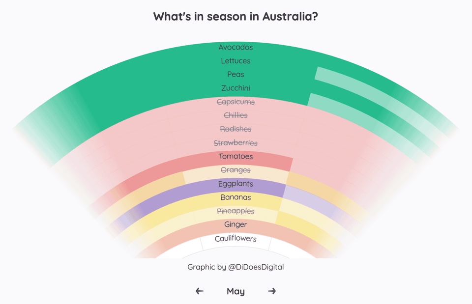
I made this interactive data visualisation to learn more about food seasonality and answer questions like…
- When are the good strawberries in season?
- Why are capsicums so expensive? How far did they travel to get here? Interstate? From overseas?!
- When should I buy fresh blueberries vs frozen?
Data vis design links
The Dashboard Design Patterns micro-site is a great primer for designers and data analysts to learn more about recurring solutions to information design problems.
10 Tips to Visualize Data Like a Pro by Zach Gemignani covers bite-size data design challenges and solutions.
For a deep dive, I highly recommend Dashboard Psychology: Effective Feedback in Data Design by Eli Holder in Nightingale. It's an example filled piece about motivational data design using "contrast" and "commitment". You can read more of Eli's essays on 3iap.com.
Steno
Steno news
Mirabai and Plover recently featured in a New York Times story The Long Case for Machine Shorthand.
I also shared a dictionary for writing exponent numbers.
New on Typey Type
- There's a new "Qwerty steno" mode for beginners to learn the steno layout in the KAOES game before they have a stenoboard or steno engine. Thanks to trustyset for feedback on this idea.
- Lesson: The Chaos
- New Voice settings to speak words with sound
- Completed lessons with accuracy less than 90% now nudge you to repeat the lesson. Thanks to Paul Fioravanti and Kaoffie for suggesting ideas along these lines.
- Updated Announcer for screen readers and bug fixes
- New focus styles so you know where you are when using a keyboard
na2hiro has also been contributing improvements to Typey Type, including:
- the lessons index page now remembers your previous search text when you press the browser back button, and
- updating the progress page to make it clearer to new folks that you can do more than just import/export data on that page while keeping a prominent banner to back up your progress.
flurick also fixed a link to Learn Plover, since it's moved to the Open Steno Project site.
I'm delighted to see more outside contributions recently.
Books, Links, and News
Books
Storytelling with Data by Cole Nussbaumer Knaflic
This was an excellent book. Cole condensed her deep expertise down into an approachable book for busy professionals and data experts alike. If you've ever put a chart in a slide deck or wondered how to make better decisions with data, there's something for you.
I enjoyed the high level guidance levelling up every visual or piece of information to help you and people around you inform choices and take actions.
And yet I also appreciated the concrete details. For example, the author includes a list of action words as thought starters to determine what you are asking of your audience. She outlines "reverse storyboarding" and explains "preattentive attributes". She uses research.
Studies have shown that we have about 3-8 seconds with our audience, during which time they decide whether to continue to look at what we've put in front of them or direct their attention to something else.
But you can also see she's lived through a lot of tough audiences:
Another challenge is that your audience can act unpredictably. They can ask questions that are off topic, jump to a point later in the presentation, or do other things to push you off track. This is one reason it's important--especially in a live presentation setting--to articulate clearly the role you want your audience to play and how your presentation is structured. For example, if you're anticipating an audience who will want to go off track, start by saying something like, "I know you are going to have a lot of questions. Write them down as they come up and I will make sure to leave time at the end to address any that aren't answered. But first, let's take a look at the process our team went through to reach our conclusion, which will lead us to what we are asking of you today.
Development
Dev links
I wrote a blog post about moving from Neovim to VS Code. More precisely, it's about how to use Neovim in VS Code.
While building Can I Eat It Yet?, I also wrote a notebook about Rotating SVG paths.
Alex Chan wrote A designer’s guide to loving the terminal. I'd also suggest it can be handy for designers to learn 1 or 2 command line tools well for automating tasks you do frequently. For example, you could learn ImageMagick to resize and convert images or create animated GIFs from a group of images.
Winning
Winning at starting at a new company
- Why you need a "WTF Notebook"
- I have a very specific (and pretty easy) strategy for this when I join a new org... | Hacker News